Wednesday, September 2, 2020

 Hi there. I've been very lax about making blog posts this past year. Part of the reason is that I've found Blogger cumbersome to use. Posting photos takes several tries to get them positioned where I want them and sized correctly. And getting text colors changed for showing links also takes many attempts before it finally works. 

So I decided to move my blog to WordPress where my website is located. I hope I will post more regularly since it is easier to use. I also decided to change its name from blog to The Art of Skipping Stones and changing the format to a shorter one for insights, inspiration, and thoughts instead of longer posts on techniques and projects.  I hope to see you there. The Art of Skipping Stones

Monday, July 20, 2020

Do You Have a Favorite Visual Effect in Artworks?

      When you visit an art gallery or museum or exhibition do you notice that certain types of art attract your attention more than others? Do you try to take time to find out why you like them so much? Over the years, as I’ve explored art, I've realized that one of the things that appeals to me is subtlety. I do like bright, bold colors, also, but find that what impresses me most are details that suggest rather than state loudly. So naturally, as my work has evolved, I found that I often use varying levels of values of the same hue to create subtle contrasts which has led me create a look of transparency.   
     When I dye fabric using fiber reactive dye, I often dye several pieces at the same time using different dilutions of the same dye mixture. I manipulate the fabrics the same way so that they will have the same type of patterns on them. To get the effect of transparency, I place two of the fabrics, one light in value and one darker, side by side. I look for similar markings on them that will line up with each other to make it look like one piece of fabric is partly transparent and overlapping the other.  Or I print an image across them to connect them, visually. Below is a close look at the bottom section of Letting Go where I placed three different values from the same dye mixture.
Letting Go (detail at bottom)
     
Letting Go


     Sometimes, even different patterns will work. For example, In my piece, Emerging, I put a dark gray rectangle on top of a medium gray background. The background was created by printing a shibori-type pattern with thickened dyes. The dark gray piece was dyed using low water immersion and scrunching the fabric. I had not originally intended to use these two fabric together, but when I placed them together on the design wall to check values, I could see several places where, if I cut them correctly, I could match up patterns to look like one flowed into the other. To me, it looks like a semi-transparent darker rectangle is sitting on top of the background, letting the background peek through. In reality, they are both cotton broadcloth (opaque).


Emerging (Detail)

     I can also get that effect with two fabrics of different hues. If part of their edges line up with a similar marking on both sides, it will suggest that it one piece is overlaying the other. For example, placing the gray fabric next to the blue fabric looks like one is laying on top of the other because the darker markings on both line up. To do that, I had larger pieces of both fabrics and moved them around next to each to find a place where the patterns matched. Then I cut the fabric pieces using those portions of them.


Little Transformation 22


     That same sense of layering can be accomplished with paint. I use transparent paints which can allow some of the background to show through. On the lower portion of Emerging, I printed the embroidery image with a dark paint. Above it, I used a much lighter value of paint, matching up the markings on the thermofax screen as I printed. So again, it looks like a semitransparent piece is laying on top of the background and that the background is the layer with the printed embroidery instead of the darker top rectangle on which it actually is painted. 


Emerging

Another way to aid in transparency is to alter thread color. I add to the transparency effect by varying color and value in the threads I chose to use to finish the artwork. In the Transformation series, I stitched a running stitch along the outer edges and changed the color of the thread to match each fabric. On Taking Root, for example, I switched the thread color from light green to darker green, to very light gray to darker gray.

Taking Root

Taking Root
Detail of edge


I want to give a shout out to some artists who have helped me learn about transparency. One of them is Christine Barnes. I've learned a lot about how to get the transparency effect by reading her newsletters. Another source for me was the book Color and Composition for the Creative Quilter by Katie Pasquini Masopust and Brett Barker.
     I find that I’m at the point in my artistic practice where I actually try to plan on having these effects in my works. I enjoy the challenge of doing it and it is one of things that has helped me to define my style. One of my favorite things to do when admiring art is to take the time to analyze specifically what I like best about it. It allows me not only to appreciate the piece, but also to be inspired to incorporate it in my own art in my own way. 
     Thanks for taking the time to read this and I hope to hear from you in the comments. 


Wednesday, July 8, 2020

How Do You Transfer Images to Fabric?

     Do you have a favorite image transfer method? There are so many ways to do it.You can take a photo and transfer it from paper to fabric directly using various media. You can get a digital image of it and use transfer papers. You can make a stencil and paint it on. You can thread sketch or thread paint it on to the fabric. I've tried all of these and they all work. But what has turned out to be my favorite transfer method is using a thermofax. (I'll explain the thermofax at the end.)
  Lately, the images I want to transfer are embroideries. On several of my trips overseas, I've visited tailor shops. I just walk in to see what they are doing. They are always busy places and in Asia they work with amazing fabrics and embroideries. At one in Vietnam, I saw a heap of scraps of them scattered on the floor and asked if I could buy them. They sold me a bag of the ones I chose and charged me based on the weight. At one in Bhutan I asked if I could buy them and they refused to take payment. They put a bunch of them in a bag and gave them to me.
     At first, I just kept them and admired them, not wanting to use them.
some of the embroidery fragments from Vietnam
     I decided that transferring the image would be a good way to use them without using them up so I tried to make a thermofax image of one. To do that, I took a photograph of it and then used the App ArtStudio to turn it into a completely black and white image. It took several steps to simplify the photo and get the image I wanted. Then I fed the black and white copy through the thermofax machine on top of the screen film. It burns holes in the film wherever there is black on the copy. I taped the edges of the screen with Gorilla Tape to stabilize it and then it was ready to use with paint or dye to make prints just like you would use a silk screen.
original embroidery fragment

thermofax screen of the embroidery


     Before printing on the artwork, it is important to practice printing it to get the correct color and value. To do that, I mixed Prochem transparent fabric paint with their colorless extender in various proportions. The extender makes the paint more transparent. And then I printed it on a spare piece of the same fabric I was using in the artwork.
TIP: always dye extra fabric (or have extra pieces of your commercial fabric available) to test print on so you don't spoil your artwork. 
To show you how the extender affects the paint, here is one of the experiments I did. In this experiment, I first stenciled red fabric paint onto pink fabric (#1). Then I mixed the red paint with some extender and stenciled again (#2). And added more extender to the paint and so on. I recorded how much paint and how much extender gave each result. Numbers 8 and 9 were so faint that I circled them so that, in the future, I would realize they were there.
(I sew all my experiments onto cardstock, record info on the cardstock, and store them in a 3-ring binder. Not beautiful, but informative and handy for reference.)

Then, I was ready to print on my artwork. I made one print in one dilution and added extender to the paint as I added prints across to the right side so that the image would seem to be disappearing. After I finished, I fused the artwork to felt and then added handstitch. I changed the color of the thread on the embroidery images to get lighter in value as it went to the right and also had the stitches get more sparse (also to add to the effect of it disappearing).  The artwork is called Clarity and is about how things become more clear and fade away and become clear again during our lives. 
Clarity detail


Clarity
 So, if you are interested in doing thermofax prints, you have a couple of options. One of them is to buy a thermofax machine. That's not such an easy or economical way to go unless you will use it often. The machines haven't been made since the 1970's and you can only buy used ones. They are in high demand and are usually over $1000.  The better option for most people is to find someone online who will make your screen from a photo you send them and then send the screen to you.  You can do a google search for custom thermofax screens to find them and compare costs. There are several people on Etsy who offer that service, too.
    I hope this information was useful to you. You can visit my website if you'd like to see more details of the artwork. Thanks for visiting.

Friday, August 30, 2019

Which Social Media Posts Do You Prefer To Use?

     I can't believe it's been more than six months since my last blog post. I used to look forward to writing it each week. Then it was every two weeks and then it trailed off even more. I've been posting on my facebook page, and my Instagram  page regularly, though. I find it much more enjoyable to post a quick photo and a small phrase or two than to write paragraphs and fit in photos. I don't know what the future will be like for my social media posts, but for now, if you want to see what I'm working on, head over to Instagram. I find I'm not reading that many blogs from others anymore, either. I've found them on Instagram and follow them there. I may post here every now and then or may get back into blogging a lot, but probably not for awhile.
     So what's been going on in my art world? I've developed a love for working with thickened dyes. I use Procion MX dyes from Prochemical and Dye and print paste from them, too.  I love how much control I have with them as to the final color and value that will end up on the cloth, being able to paint, stamp, and screen with them. I did a color study with the pure dyes I have, mixing one color with another little by little to create cloth samples with color possibilities and a record of how to get them.

I printed up yardage using four layers of dyes and a variety of tools and made a set of 12 napkins.

And I made two art pieces using ethnic motifs I found while traveling and converted into thermofax screens. These photos of them are quick ones I did with my iPhone. And I may still add some stitching to them.
top section


bottom section


whole piece  Size is about 36 x 23
The background was made by screening on print paste and letting it dry and then painting on thickened dye. The print paste acted as a mild resist.
     I had printed several other cloths in bright colors to test out the resist effects of print paste and ended up fusing them together and printing on top to create this next one.
side view
front view
And I've been busy getting published. I joined TAFA, Textile and Fabric Artists list, (I'd add a link, but their website is down.),  I was a featured artist in Artsy shark, and I have an article on TextileArtist.org.  
I'm an enthusiastic member of SAQA and have an artwork in their upcoming auction.


     So now, I have several other ideas brewing and experiments going to pursue using those motifs from other countries in a series. I'll be posting my progress on Instagram. If you follow me there, you'll also see photos I take on a bike trail I frequent because I am so inspired by the nature that surrounds me there. I'm linking this to Off The Wall Friday where you can other artists' blogs. Please make comments on their posts so that they know you stopped by. Thanks for visiting.


Friday, February 8, 2019

Are You Technique Driven?

     When you create art, is it concept that drives you, technique, or something else? I used to be technique driven. That is to say, I was trying to learn new techniques and would create art as I learned the new skill. Then I would move on to the next latest greatest technique. That led to me having a good time because I love to learn new things and it led to some satisfying pieces, but it also had me creating pieces in isolation of each other. There was no theme or concept connecting them and they seemed to be in all different styles. I don't view that as a bad thing, though. I was enjoying the process and I was growing.
     In the past few years, I've abandoned several of the processes I didn't love (piecing and heavy machine-quilting to name two). I've also started creating in series with a common theme because it gives me the opportunity to explore the concept in depth and develop it more deeply. I felt that the energy I had for my last series on transformations has run dry and have been playing around with some new ideas for a series. To get going, I deciding to have some studio days doing one of my favorite techniques; thermofax screen printing. I got a great deal from a friend on a thermofax machine which allows me to make screen images on the spot.
     The images I've been working with have been influenced by some of the fabrics I've seen on my trips. I loved the patterns I saw in Morocco and Jordan. I love the fabrics from India. And when I was in SE Asia a few years ago, I collected remnants from the floors of tailor shops because of the beautiful embroideries on them. I've been craving using these global textile patterns in my art, but didn't know how to connect them to a meaningful series without being trite or using cultural appropriation. I photographed the textiles, manipulated them with various apps into black and white graphics, and made thermofax screens of them. And I had a blast printing them onto test fabrics.
On my design wall: top portion are thermofax prints, bottom portion has dyed pieces.
Also on the design wall
experimenting with transparency


     I used the reverse side of pieces of previously worked fabrics that I wasn't crazy about. They were all various hues of blue and blue-green, which turned out to be good because I didn't have to make color choices. It set a limit to the colors for backgrounds and I stayed within the blue family for printing just to see the imagery in different values so that I could focus on the patterns and what they might mean to me.
more thermofax prints
 I pinned them to my design wall to let the imagery sink in over a few days. And then something happened to create a spark. My husband was cleaning out the attic and found my precious old Nancy Drew books. I saved them originally to pass them on to my children, but, as it turned out, I never had any. Rather than donate them somewhere, I thought maybe I could use the paper for paper lamination or use the pages in the book for creating journals. I ripped some pages out and monoprinted onto them.
monoprinted book pages
then thermofax printed

     I laminated them onto some fabric using the global patterns and I loved the way they looked. And the ideas on how to use these cultural motifs just started flowing.
On my printing table:
The two on the right are paper laminated. One on cotton broadcloth and one on poly sheer
The one of the left is monoprinted and then thermofax screened.

  In this case, it was technique that led me to a new direction. I know that creating the new pieces will be a joy because I love the process of screen printing and the images I'm using bring back a flood of good memories. So, I guess for now I am both technique and concept driven. The thermofax printing will allow me to use the imagery I've been longing to apply. By the way I'd like to pass on my enthusiam for the thermofax so I'm thinking about teaching some classes on how to use it. (You don't need a thermofax machine... you can get your screens printed from many places online.) I would teach the class out of my studio in Central Florida so if you are interested, please email me and we can set it up.    Reginabdunn@gmail.com
I'm linking this to Off The Wall Friday where you can find other artists blogs. Please make comments on their posts so that they know you stopped by. Thanks for visiting.

Friday, December 7, 2018

What To Do With Old Work

     Before I revamped my website, I had all my old art quilts on it for sale. They were there for years. Then, when I created my new website, I decided to post only my newer works. The older ones weren't part of a series. They were important steps in my growth as an artist because, in each one, I explored a theme or a technique and I learned about various topics such as color, composition, line, etc. But they weren't important to me anymore. So I put them in my "Gallery Under the Futon". I realized that they were probably never going to be sold and didn't want to gift them to someone who may not be crazy about them. And, since, they weren't characteristic of what I want to create now, I took my labels off the back so that I wouldn't be associated with them. I donated them to Ruth Funk Center for Textiles in Melbourne, Florida. They wanted art quilts donated so they could auction or sell them as a fundraiser to improve their storage facility. I ended up giving them 11 art quilts. It felt good. I hope the money will help them because I love that museum and enjoy seeing the exhibits there. And since I took my name off the pieces, my current art will not be devalued if they only sell for a pittance.
     But I didn't give them all my old art quilts. Two of them weren't worth sharing, so I threw them out. Two more had some promise so I trimmed them down to the parts I still liked. For one of those, it now seemed like a complete composition. It was already backed and quilted but to give it a more arty look, I fused it to ecofelt  to stiffen it up. I cut the edge of the binding off because it didn't seem to contribute to the overall look and then I painted the edges with dark blue paint to keep them from raveling. Now it hangs in my entrance hallway and I'm really pleased with it. All it needs is a name.
Unnamed
     In November, I wrote an article for  HandEye Magazine. They asked me to write why I make art. Writing it, was a good reflective exercise. And two of my smaller works got juried into the exhibit Small Things Considered at Arts On Douglas, a fine art gallery in New Smyrna Beach, Florida.  As its name suggests, it is an exhibit of smaller artworks they do every December with the idea to sell art for holiday gift-giving.
My two mounted on black linen-wrapped canvas

So now, I'm winding the year up with smaller holiday-themed projects and enjoying not having artworks sitting around gathering dust. It leaves me open, mentally, to create anew. I'm linking this to Off The Wall Friday where you can find art blogs. Please make comments on the artists' posts so that they know you stopped by. Thanks for visiting.

Tuesday, October 9, 2018

Experimenting With A Product

     Do you like to run experiments when you discover a product you've never used? I think I originally became a scientist because I love to do experiments. Now that I'm an artist, I find this skill handy and still fun. The product I'm writing about is called Fiber Etch. I found out about it from Jane Dunnewold when I took the Art Cloth Mastery Class and decided it had potential in my artwork so I ordered a bottle of it. Basically, it destroys cellulose-based materials, which means you can use it to selectively dissolve cotton fabric.  My friend, Angie Knowles, sent me a sample of a silk-cotton fabric she had purchased so that I could try Fiber Etch on it.
     Here's what I did and the results:
1.) I applied the Fiber Etch (which is a thick liquid a little thicker than maple syrup) through a thermofax screen onto the fabric.
the fabric wet with fiber etch
the thermofax design I used
2.) I let it dry overnight.
3.) I ironed it to heat-destroy the cotton fibers where the Fiber Etch had made contact.
the brown parts are where the cotton got destroyed

4.) I soaked it in warm water for about 10 minutes and softly rubbed it with my hands.
5.) I hung it to dry
6.) I ironed it flat and brushed it with a scrub brush (but gently) to remove any stray cotton fibers.

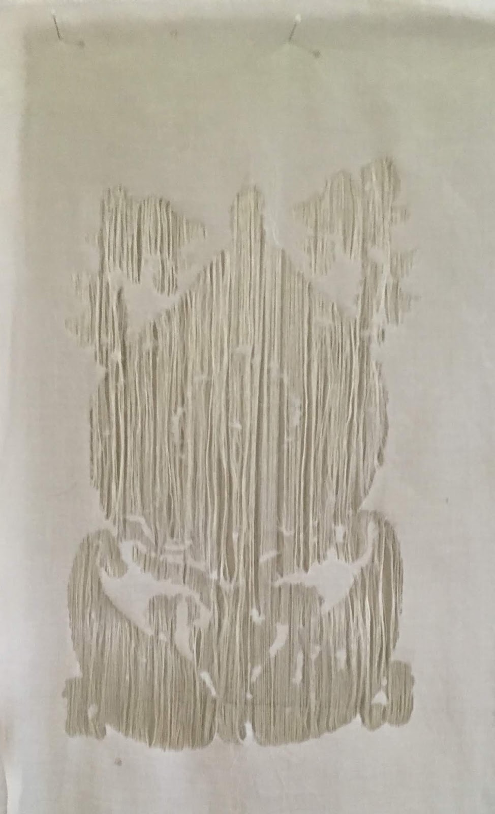
this design was not a good choice since it didn't keep the detail... too much cotton got destroyed.
I redid it with 3 other thermofax screens to try for a more suitable design for using with this product
You can see from the results that this particular fabric is made using silk woven in one direction and cotton in the other, so the result from the fiber etched parts is silk fibers running in one direction with no fibers woven with them in the areas that got etched. This works ok for designs with thin lines or thin shapes, but leaves an area too open for designs with bigger shapes.


7.) I put it in a dye bath of  procion MX dyes ( sun yellow mixed with mixing blue 50:50). (I chose this color mixture because I was aware that cotton turns a different green hue in it than silk does).
8.) Batched it for 24 hours, rinsed it, dried it, and ironed it.
the silk fibers dye a more yellow green and the cotton fibers dye a more blue-green. 
You can see the silk fibers running vertically in the etched areas. 

I had previously tried this product with a poly-cotton fabric in which the all the threads are a mix of cotton and poly. The result is more effective with this type of fabric because you end up with woven shapes in the etched areas, but they are thinner since all the cotton gets removed and only polyester remains. 
The remaining polyester threads (in the etched areas) don't accept the dye; only the cotton does.
So you end up with your thermofax-etched areas staying white
The whole cloth dyes lighter than expected since the polyester part doesn't accept the dye.
I have more things I want to try with this product, but this is a good start and I found it interesting to see how the thread structure plays a roll in the results. I'm linking this to Off The Wall Friday where you can find other art blogs. Please make comments on the artists' post to let them know you stopped by.  Thanks for visiting.