Showing posts with label gelatin monoprinting. Show all posts

Friday, February 8, 2019

Are You Technique Driven?

     When you create art, is it concept that drives you, technique, or something else? I used to be technique driven. That is to say, I was trying to learn new techniques and would create art as I learned the new skill. Then I would move on to the next latest greatest technique. That led to me having a good time because I love to learn new things and it led to some satisfying pieces, but it also had me creating pieces in isolation of each other. There was no theme or concept connecting them and they seemed to be in all different styles. I don't view that as a bad thing, though. I was enjoying the process and I was growing.
     In the past few years, I've abandoned several of the processes I didn't love (piecing and heavy machine-quilting to name two). I've also started creating in series with a common theme because it gives me the opportunity to explore the concept in depth and develop it more deeply. I felt that the energy I had for my last series on transformations has run dry and have been playing around with some new ideas for a series. To get going, I deciding to have some studio days doing one of my favorite techniques; thermofax screen printing. I got a great deal from a friend on a thermofax machine which allows me to make screen images on the spot.
     The images I've been working with have been influenced by some of the fabrics I've seen on my trips. I loved the patterns I saw in Morocco and Jordan. I love the fabrics from India. And when I was in SE Asia a few years ago, I collected remnants from the floors of tailor shops because of the beautiful embroideries on them. I've been craving using these global textile patterns in my art, but didn't know how to connect them to a meaningful series without being trite or using cultural appropriation. I photographed the textiles, manipulated them with various apps into black and white graphics, and made thermofax screens of them. And I had a blast printing them onto test fabrics.
On my design wall: top portion are thermofax prints, bottom portion has dyed pieces.
Also on the design wall
experimenting with transparency


     I used the reverse side of pieces of previously worked fabrics that I wasn't crazy about. They were all various hues of blue and blue-green, which turned out to be good because I didn't have to make color choices. It set a limit to the colors for backgrounds and I stayed within the blue family for printing just to see the imagery in different values so that I could focus on the patterns and what they might mean to me.
more thermofax prints
 I pinned them to my design wall to let the imagery sink in over a few days. And then something happened to create a spark. My husband was cleaning out the attic and found my precious old Nancy Drew books. I saved them originally to pass them on to my children, but, as it turned out, I never had any. Rather than donate them somewhere, I thought maybe I could use the paper for paper lamination or use the pages in the book for creating journals. I ripped some pages out and monoprinted onto them.
monoprinted book pages
then thermofax printed

     I laminated them onto some fabric using the global patterns and I loved the way they looked. And the ideas on how to use these cultural motifs just started flowing.
On my printing table:
The two on the right are paper laminated. One on cotton broadcloth and one on poly sheer
The one of the left is monoprinted and then thermofax screened.

  In this case, it was technique that led me to a new direction. I know that creating the new pieces will be a joy because I love the process of screen printing and the images I'm using bring back a flood of good memories. So, I guess for now I am both technique and concept driven. The thermofax printing will allow me to use the imagery I've been longing to apply. By the way I'd like to pass on my enthusiam for the thermofax so I'm thinking about teaching some classes on how to use it. (You don't need a thermofax machine... you can get your screens printed from many places online.) I would teach the class out of my studio in Central Florida so if you are interested, please email me and we can set it up.    Reginabdunn@gmail.com
I'm linking this to Off The Wall Friday where you can find other artists blogs. Please make comments on their posts so that they know you stopped by. Thanks for visiting.

Saturday, June 2, 2018

Can Art Be Hung In A Window?

     Have you ever hung any of your art in a window? Usually I wouldn't because I'd be afraid the sunlight would cause the colors to fade. But I have a sliding glass door that I want to mark so that people don't walk into it thinking it is open. (I did that once and almost lost a tooth because I hit it so hard.) I could hang a small piece of metal art or plastic or some other solid one of those clear suction cup hangers. Instead, I decided to try a different sort of fabric art that I'm hoping won't fade.
     I monoprinted regular copy paper with colors of my Prochemical fabric paints. I could have used any type of paint, but I have a nice supply of that in a variety of colors and love it. I allowed the papers to dry. Next, I got a piece of sheer polyester fabric prepared by screening on Color Magnet and dyeing the fabric in dilute black procion mx dye. The dye washed out of the fabric everywhere except where I had screened on the Color Magnet.
     Then I used a technique described in a book by Jane Dunnewold and Claire Benn on  paper and metal leaf lamination to attach the colored papers to the prepared polyester. To get the design, I used a thermofax screen of vines that I had made from my photos to screen on the gel medium to the sheer fabric. After that was done, I applied gold leaf also with a thermofax I had made from one of my photos. Then I did some hand stitching to laminated vines. To complete the artwork, I sewed the laminated polyester fabric to a commercial sheer polyester fabric that had a scroll design embroidered onto it so that when hung in the window, the scrollwork will be visible through the laminated polyester.
Close-up showing the "paper" vines, stitching and gold leaf.
NOTE: you can see some of the scroll work on the under sheer through the top sheer
I put the word paper in quotes above, because the paper is actually gone. It gets washed away in the process, leaving only the paint. But a different look than if the paint was applied directly to the fabric instead of in the lamination process.
Close-up of it hanging in the window


     To hang it, I sewed the top over a painted dowel, attached some wire to the top and sides of the dowel to make the dowel look a little nicer, and hung it from a clear, suction cup hanger stuck to the window. I purposely cut the fabrics beforehand so that the polyester underneath with scroll work would be longer and hang out the bottom.

On the window just after sunset
     I love how it looks in the window. It's size is about 12 x 8 so it still leaves lots of clear window to see outside. And it's character changes as the light changes during the daytime and in the evening which makes it an interesting piece. How long the colors last in the exposure to sun remains to be seen, but since they are applied with gel medium, I expect them to last awhile.
     And I have news... I'm having a solo show of my work this summer in a local gallery. The gallery is an interesting one. The front section is the art gallery while the rooms in the back house a salon. And it is located in an alley of the main street. The alley has a great gift shop, up-scale kitchen shop, and comes alive on Friday nights with food trucks, music, organic farmer's market, and even bat houses from which the bats swarm at sunset. It's called The Blake Elliot Gallery The opening reception will be Friday, June 22, 6 PM - 9PM. If you are in the area, try to come. It should be fun.

Promo for the exhibit
     I'm linking this to Off The Wall Friday where you can find other fabric related artworks. Please make comments on the artists' posts so that they know you stopped by. Thanks for visiting.


Monday, February 29, 2016

Will You Settle For a Design You Aren't Thrilled With?

     Since I wasn't thrilled with my first attempt at a wildflower quilt, and it was going to be displayed in City Hall, I knew I had to make another one pronto. Luckily, as I was packing some previously made quilts to take with me for show and tell, another inspiration struck. I was choosing to take this small quilt called Continuity with me that I liked a lot and I thought its design would do well for a wildflower quilt.
      So I got out my gelatin plate (a store bought Gelli plate) and I mixed up paints in similar colors to the ones on Continuity and I monoprinted some fabrics on cotton muslin. I wanted to use hexagon shapes in the background, so to create those, this is how I did it using two toilet paper rolls, duct tape, and some wire:
1.) I measured one-inch intervals on the wire strip and bent it at one-inch intervals until I had six sides. (I used a printed hexagon as a template to get the angle correct.)
2.) I cut up the side of one of the toilet paper rolls lengthwise.
3.) I cut up a one-inch length on the other toilet paper roll and taped it into the other roll to make it larger.
4.) I wrapped the six-sided wire strip around one end of the newly formed toilet paper roll and bent the end of the roll into a hexagon, wrapping duct tape securely around the wire so that it would hold its hexagon shape. And voila, I had a hexagon stamp.
my sturdy hexagon stamp
     Then, after I spread the paint on the Gelli plate with the brayer, I gently pressed the hexagon onto the plate here and there before I put the fabric on top. 
     And here are some of my fabrics after printing.
This collage was made with the App Pic Collage
     I cut the fabrics into various sized rectangles and sewed them together, put them onto batting, thread sketched one of my wildflower shadow silhouettes,  hand sewed on various sheers, stamped other design elements, did some embroidery, added a pillowcase backing, and then machine sewed onto the flower again. And here is Continuity II.
Continuity II
I'm very happy with this one. It measures 20 inches x 29.5  Here is the artist statement for it:

Wildflowers are a sight to see when they are in masses in fields and on the sides of the road. But they are in peril for several reasons. One of those is the disappearance of the honeybee. The flower and the bee depend upon each other. Will the flowers and the bees continue or will the cycle be broken and these shapes remain only in our imaginations?

As for my "failed" wildflower quilt. I think it needs more contrast in some areas and I'll work on it more some other time after I let it sit awhile. But I think it's important for me to post my not so good attempts here as well as the successes so that beginners can see that it's ok and normal for not all art to work out. It makes me feel less insecure when I see some expert artists post some of their "failed' attempts, too and when they discuss what went wrong.

     In my last post I told you that I had big news. I've been accepted into Jane Dunnewold's three year Art Cloth Mastery Class in San Antonio. It involves me going out there to her studio five times during the three years and working in between sessions at home. The first session begins Sunday, March 6. She sent pre-assignments and I've been busy working on them for weeks. I've read poetry. I read Molly Bang's Picture This which was amazing. I've read many books on design and composition, but this one was exceptional. Also on the reading list was a book about Notan in which I learned a lot from doing the exercises in the book. I read Drawn To Stitch, which I had to review for the class. I had to prepare texture studies, collect color samples, and collect imagery for symbols I might want to work on for the three years. Needless to say, I'm very excited about it. I'm at a point in my artistic endeavors where I need a push and advice from someone with a lot of experience and I've admired her words and work for a long time so I'm jumping in.
     I'm linking this late to Off The Wall Friday where you can find other art quilt blogs. Please make comments on there posts so that they know you stopped by. Thanks for visiting.


Thursday, February 19, 2015

Is There More Than One Shade of Gray?

     Are you tired of hearing about the shades of gray yet? I guess it depends on the context. I needed a sitting human figure for one of my quilts and I needed it to be a gray. But I needed it to be a greenish blue gray. The only college art class I got to take was Painting 101 and I took it only a few years ago. It was a very useful class for my art quilts. We spent a huge amount of time studying gray. We had to mix our own. The teacher could tell if we made our gray by mixing white paint with black paint. That was a big no no. We had to make our grays by mixing cadmium red light with ultra marine blue and then add white. Sometimes you need to throw in a little cadmium yellow if it has a purple tinge. We could make warm grays by having more cad red or make cool grays by having more of the blue. I learned to love all the hues of gray. I actually got (and still do) very excited when I mix a particularly wonderful hue of gray.
     One of the assignments was to paint a color wheel. It took hours and hours to get it right. It was a major homework assignment. I refer to it often to choose colors and to figure out how to mix colors. What a great class to take even though it was nothing about quilts or fiber.
my color wheel from class
      Today, I got out my paints, GAC 900, my gelli plate, some white cotton muslin, and various texture tools.
paints I used today
Notice that I used all sorts of brands of paints. I use whatever is on sale. I do mix them with GAC 900 fabric medium from Golden so that they play well with fabric, though. My first prints were a little greenish, but soon I had the right fabric.


one fabric
another fabric
Then I cut out the figure that I needed and tried it out on my quilt. It looked exactly the right color and texture.
Sitting on white paper
I won't show it yet on the quilt until the quilt is finished. The answer to the question is that yes, there is more than one shade of gray. And it is fun to mix gray. I strongly advise you to buy some cadmium red light, ultramarine blue, cadmium yellow light, titanium white, fabric medium, and play. For fabric, you can use old bed sheets, old shirts, or you can buy white muslin or any other white fabric. I'm linking this to Off The Wall Friday where you can find other art quilt blogs. Please make comments on the artists' posts so that they know you stopped by. Thanks for visiting.

Friday, January 2, 2015

From Photo To Sketch To Fabric

      My art group, ArtsEtc, meets once a month except for July because that meeting falls on the July 4th weekend. This past summer, a small group of us decided to meet at my house that weekend and take a walk at a local park and take photos for inspiration. I came away with photos of Spanish moss hanging from large live oak trees, and close-up shots of beautiful textures on leaves and bark. The sunlight of the early morning left wonderful patterns peaking through the foliage as we walked down the shaded path towards the lake. Suddenly, the trees opened up before us when reached lake and this is one of the many photos I took as an osprey sat on one of the piers as it fed on a fish it recently caught that morning.
early morning on the lake
     I knew that I wanted to capture this moment in my art somehow. It was very quiet. I could hear the water lapping against the piers. I could hear some birds in the distance. No traffic noise at all. No wind. None of us spoke.
     So at my sketching group, I made a few sketches with this photo as the focal point. Some were more realistic. Some were more abstract. I eventually settled on one that I liked a lot that is a stylized landscape.
     I got out my monoprinted fabrics from here and some older ones and started laying them out on my design board to fit into the sketch background. That was the easy part. The harder part was to figure out how to translate the lines I had drawn on the sketch into fabric. I could couch them on with fibers, I could do bobbin work with thick thread, or I could try to paint the lines on. In the end, I decided to put two black threads in the needle at once and then free motion stitch as normal. To do this, you thread one spool as normal, and then put the other spool on the other thread holder and thread as normal but through the other tension disk. (Both threads go through the same and only eye of the needle; size 90 universal needle.) I had no problems with thread breakage or thread tension.
     I sketched out the lines onto the yellow quilting paper first and pinned it on top of the fabric and then sewed (with the double threads) on top of the drawn lines on the paper. Then I ripped off the paper. Here's a photo that shows some of the stitching done and some of the paper still on with the sketching on the paper.
in-progress stitching
If you think the fabric with the piers is lighter in color than you saw from the link above, you are correct. That's because I decided to use the reverse side of it. I felt that the "right side" was too dark and saturated for this quilt. Here's a close-up photo of part of it.
with paper and sketching waiting to be stitched
     The color inside the piers was added with Shiva Paintstiks. Now I have the stitching done and am down to some more difficult decisions. How to do the bird and how to add Spanish moss. I've made three birds already. One that I printed onto cotton fabric from a photo, but it just doesn't fit with this style of art. One that I painted onto fabric and just doesn't fit, either. And one that I printed onto sheer fabric and it is too faint. I have a few more ideas to try out for the bird.
     For the Spanish moss, I thought I was going to use painted cheese cloth, but the texture doesn't fit with this quilt. Neither does some wool roving that I have. I need something smooth and flat to go with the lines I stitched and the flat look of the painted piers. I have few ideas to try for that, too. Time to put on the creativity hat. I'm linking this to Off The Wall Friday where you can find other art quilt blogs. Please make comments on their posts to let the the artists know you stopped by. Thanks for visiting.


Friday, November 14, 2014

Back To Monoprinting

     Now that I'm working on a larger piece again, the first step is to monoprint the background fabrics. I wanted to have several color choices to choose from and this piece is about a walk in the woods in the early morning. So I needed to use greens for the foliage, oranges for the sunrise, and blues for the water of the lake that I came upon. I mixed my own colors starting with acrylic paints of cadmium yellow light, cadmium red light, cerulean blue, ultramarine blue, alizarin crimson, and titanium white. I added equal amounts of Golden's GAC 900 Fabric medium which allows the paint to play well with fabric. I also used Jacquard's colorless extender to thin the paint so that it would be more transparent on the fabric.
     This is the first time I used the actual Gelli plate. Before this I used my home-made gelatin plates. When I took the Gelli plate out and spread the paint on, it kept beading up. I thought maybe I just had to break it in and do a few prints. But it kept beading up. I was getting ready to contact the company when I realized that I had not removed the protective plastic cover! I got some interesting prints that way, though.
     Here are some prints I got off the actual plate.
reminds me of sun reflecting on the water,
impressionistic style


might be good for background in the woods
with a foreground on top


another background


I like the white "resists" I got in this one
All of these will be cut up and used in pieces and have other elements added on top, but they are a good beginning as the bottom layer for backgrounds for what I have in mind.
I'm linking this to Off The Wall Friday where you can find other art quilt blogs. Please make comments on the artists posts to let them know you stopped by. Thanks for visiting.

Thursday, September 25, 2014

How Do You Design Your Art Pieces?

     What method is an effective method to use to design an art piece? I've tried several approaches and haven't really settled on one hard and fast method.  I think I'll try a new one here. The other day I was watching TV and saw a commercial for eyeglasses. It was a store that sold inexpensive eyeglasses and they were trying to sell the idea that you should have several different styles to suit different moods. The woman opens a drawer and inside are several pairs of glasses. She puts on one pair and says something like, "I am an artiste." She puts on another pair and says something like, "I am a business woman, bring me my pie charts." And on it goes.
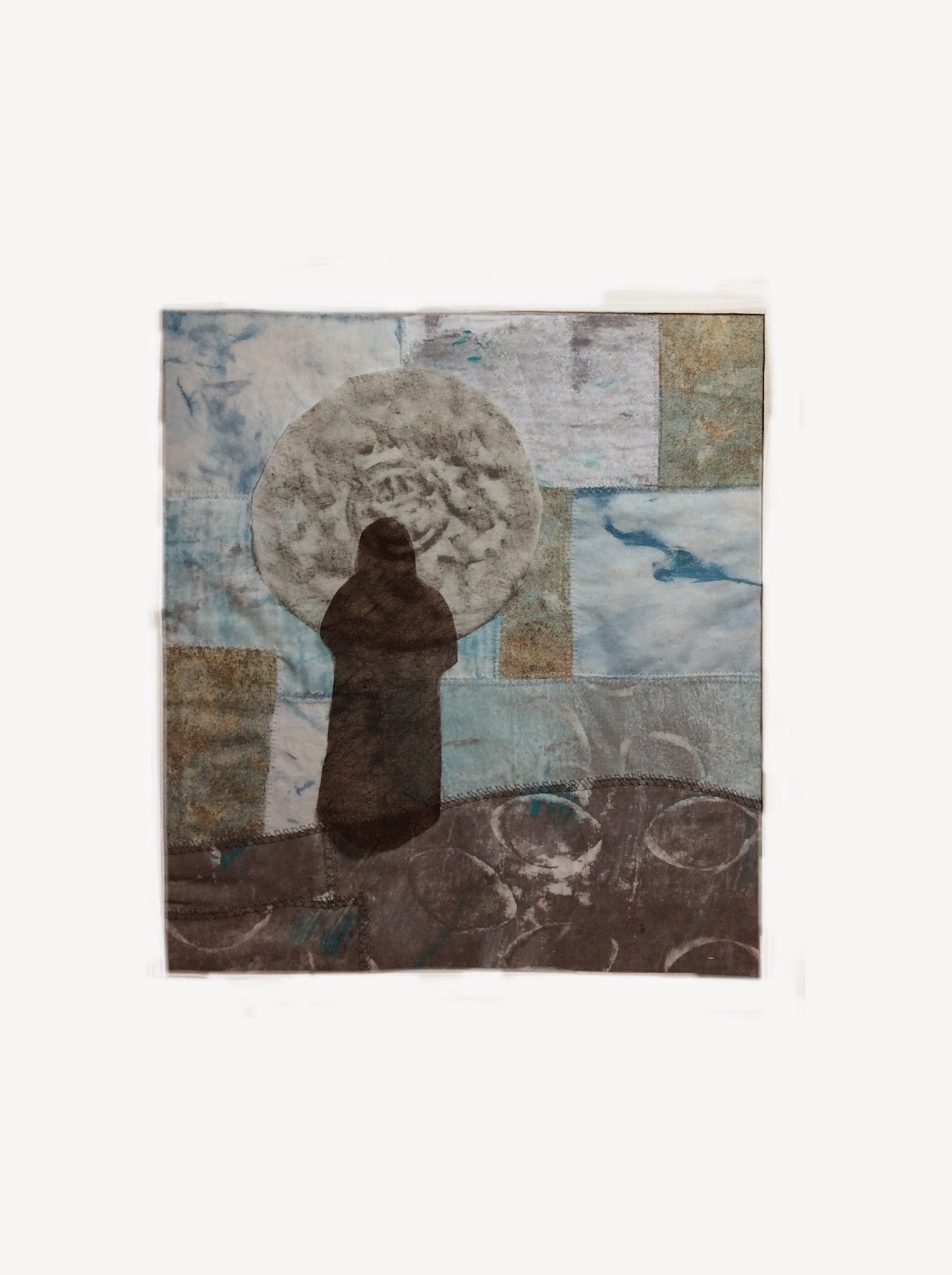
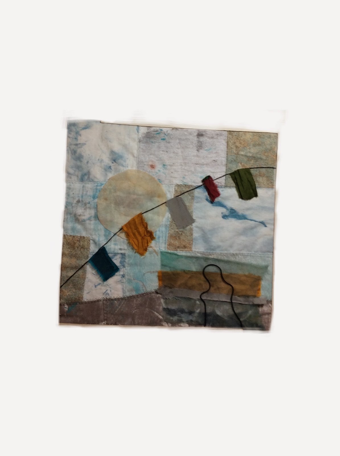
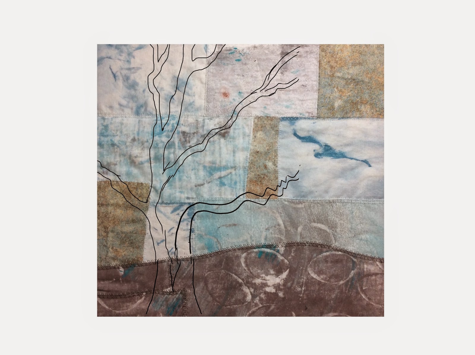
     So that gave me the idea to dress up an art background for different moods. I would take photos of each design and see which I liked the best, if any. At least it would be fun and a good exercise in composition.
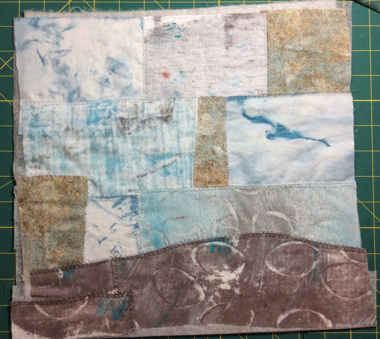
     Here's the background I have. It's about 12 inches by 12 inches. It's made of monoprinted cottons and one commercial Stonehenge cotton. I sewed the pieces together onto batting.
Background awaiting its alterations
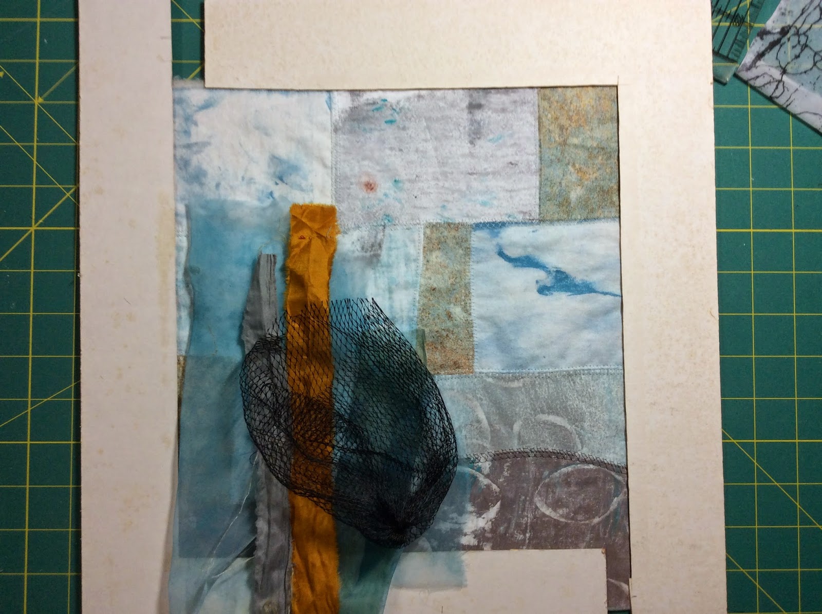
     The next thing I did was to go through my stash of fabrics and fibers and choose colors and textures that would look good as foreground elements. I chose a couple of sheers in turquoise and teal, some silk sari ribbons in gold and gray. And I put on the the black plastic veggie bag not because I'm going to use it, but because the black looks good and I'll use black thread in the sewing somewhere.
With a cardboard viewfinder

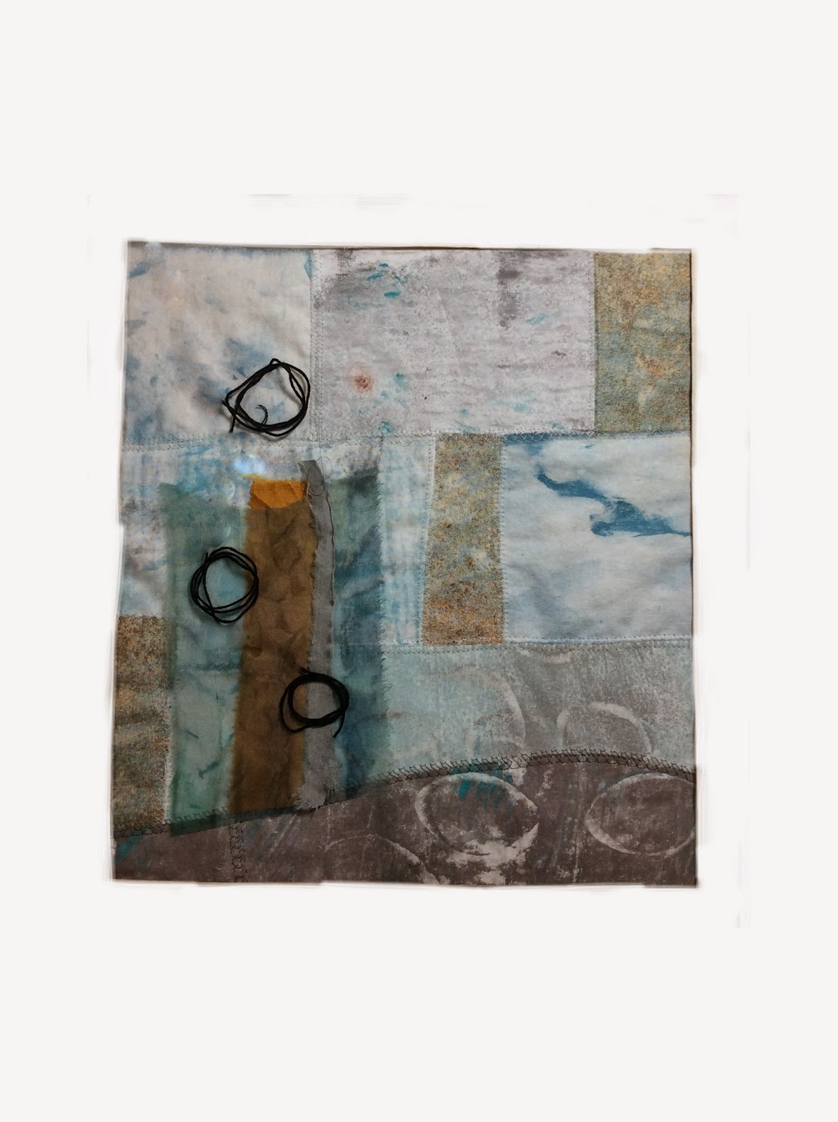
OK. Ready to go with the moods. First one is Abstract. I cut up the fabrics and placed them on, took a photo, then (because the cardboard viewfinder is so old and marked up) I used the ArtStudio App to paint white around the edges to cover up the viewfinder.
Naming this "Riding the Thermals"
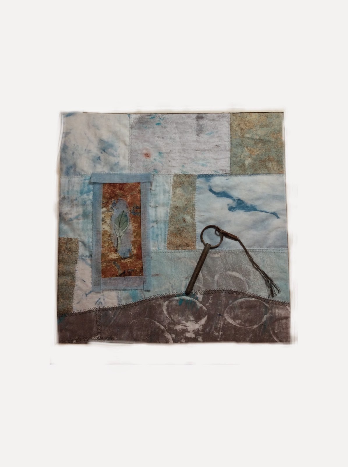
Next one is Mysterious. It has a piece of hardware on it. If I were to make this one, I might use an image of the hardware and make it look more like a key.
Naming this "Passages"
Next is Calm
Naming this Contemplation 2
Next is Spiritual. If I were to use this, I'd have text written on the prayer flags. And have a much better image of a person sewn on.
Naming this Praying for Peace
Next is Nature. The tree was added digitally. It is from a sketch of a tree from my yard. If I were to use this, I'd free-motion sew the tree on in black thread.
Naming this "Landing"
     In each one, I tried to create a focal point, tried to create a design that kept the eye moving around, tried to create three masses. In the last one, Landing, I only had two masses. I redid it later by adding a third mass under the bird and it looked better. In Riding the Thermals, I may move the frame over to the right so the bird doesn't get cut off because I think the viewer's eye may jump out of the frame otherwise.
     There are two of these that I'm leaning towards, and they are not the monk or prayer flags. As you know, things always look better once they are actually stitched. I'm not the type of blogger that only shows you finished works. I like to show you things in progress and how they are when they aren't so good, too. Hopefully, this piece will get finished and it will come out looking good in the end. It was a fun, and for me, useful design exercise. 
     I'm linking this to Off The Wall Friday where you can find other art quilt blogs. Please make comments to let the artists know you stopped by. Thanks for visiting.


Thursday, September 18, 2014

So What Do You Do With Your Mixed-Media Collages?

     There has been a lot of talk of making mixed-media collages and journal pages. So I decided to try my hand at making a couple of small collages. But since I'm a fiber artist, I didn't know what to do with the collages once I was done with them. They were made from papers and mounted onto cardboard.
     First, let me tell you how I made them. I was inspired to make something fairly quick and play with paint, paper, my gelli plate, and various tools, and just have fun in an afternoon.
Here are the ingredients:
scrap plain paper, an envelope, some gift wrapping paper, an old movie ticket, some pieces of a watercolor painting I made that didn't work out,  some postage stamps I had saved, some maps from a pocket calendar,  and magazines.

Here's the process:
1.)  I spread acrylic paints on my gelli plate and monoprinted a bunch of small papers and even an envelope.
monoprinted papers and envelope

2.)  I cut the monoprinted papers into shapes that I found in the magazines. Such as a bird shape and people shapes. I cut out words from the magazines.

3.) I cut out pieces from the gift wrap, from the watercolor painting, etc.

4.) I used matt medium to glue large rectangles of the monoprinted papers and gift wrap onto a cardboard background to create a background. This was a mistake, it turned out, because the cardboard warped when it dried. I should have also applied the matt medium to the back of the cardboard. I applied gesso to the back and then matt medium when I was finished with the whole thing and that did the trick to unwarp it.

5.)  Then, for me, the quick part was over. I couldn't decide where to put the elements. I'm a slow designer. It took several days to decide. But here are the finished collages. I glued all the pieces down with matt medium underneath and then another coat on top of the whole thing.
Big Horizons on cardboard
Big Horizons represents my husband and I as travelers, because we do travel a lot. The movie ticket is from The Adventures of TinTin which we saw in 2011. We discovered TinTin together in a used book store in Nepal in 1984 so it is very special to us. We had never heard of it before that. My husband is from Argentina, hence that part of the map.
Outside the Lines on cardboard
Outside the Lines came about because of the background of the sky. I drew in the dark lines with a gel pen after it was finished.
 
     So the question was still there. What to do with them? They are paper on cardboard. My latest meeting with my art group, ArtsEtc., was about image transfer so that idea was in my head. I decided to scan these images into my computer and print them onto cotton muslin. I knew from experience, that I needed to play with the images in Photoshop Elements before I printed them. What needed to be done, was to enhance the saturation quite a bit because the colors always print a lot more faded than they look. Also, I needed to increase the contrast on the words on the ticket a lot more so that they would show up on the fabric.
     I printed them, made quilt sandwiches, did some free-motion quilting with black thread, made a pillow-case binding, machine-embroidered around the edge. I ended up having to write on the ticket with pencil to make it darker and then paint on matt medium to make it permanent. Here they are.
Big Horizons finished

Outside the Lines finished
I'll sew on a pop top thing from a can to each back to hang them and hang them in my studio.
I'm linking this to Off The Wall Friday where you can find other art quilt blogs. Please make comments on their posts to let them know you stopped by. Thanks for visiting.


Thursday, April 3, 2014

Indigo Impression

     Now that I'm working slow for a bit, I'm taking an on-line class from Jude Hill at her site, Spirit Cloth. The class I'm taking is Spirit Cloth 101. It's all hand stitching and basically about making a sampler and I'm really enjoying it. I spent several days just reading through the posts on the class and watching the videos. Then I spent a week just thinking about what my theme would be for my sampler. And then it came to me. No surprise if you're a reader of my blog... Rocks. And Blue.
     I went through my bin of blue fabrics and found two pieces of indigo cotton that I had dyed with my ArtsEtc group many years ago and had only used a small portion of. I treasured this fabric and this project would be perfect for it. I found some commercial fabrics that went well with it and some oranges that would be good accents. Here are some fabrics that may get used.
Indigo with possible accent fabrics
     Then I monoprinted some fabrics in various grays in rock textures using a procedure I developed
to mimic having a moldy gelatin plate using a permanent gelatin plate. You can visit this older post to see the procedure here.
     Here's a photo of the fabrics I monoprinted.
Monoprints sitting on Marcia Derse fabric with
a previously painted rock on top

     Finally, I got busy and actually hand-pieced a nine patch. As I was sewing, I was thinking that I could machine stitch it so much faster. But then I would be missing out on the idea of spirit cloth so I got into the rhythm of the stitch and it went well. The next step was to do an invisible baste onto a thin cloth instead of batting to stabilize it and get it ready for the appliqué step to come.
Nine-patch basted onto its stabilizing cloth
     I have several ideas floating in my head of how to place the rocks, what accents to add, what to embroider, etc. But these things change one by one as the pieces get added and I see how one thing affects another. I'm linking this to Off The Wall Friday where you can find other art quilt blogs. Please make comments on their posts to let them know you stopped by.

Tuesday, March 18, 2014

My First Quilt

     I realized that this my 104th post! I missed celebrating my 100th. So I'll take the time now to reminisce.      
     About 14 years ago, I was shopping for a comforter for our bed and couldn’t find one that I liked. A quilt shop, Quilt Shop of DeLand, had just opened up in our town and I was walking by and stopped in. I asked if it was difficult to make a quilt, and Judy, the owner, said she was offering a weekly class at night on how to make a sampler quilt that would be a perfect way to start. So I decided to take the class and make the sampler for our window seat in the bedroom and then later make a quilt for the bed to match. I had an old Singer Touch and Sew Machine from the 70’s and the class was a machine sewing class.
     I bought the book to go along with the class, Start Quilting with Alex Anderson and fabrics under the direction of Judy. I remember her telling me that such and such a color would make it “pop”. She was right about all the fabric choices. Now I know that I was choosing light, medium, and dark values. And I was choosing some complimentary colors, too. But at the time, I had no art training and had no idea about those terms or concepts. I just followed the directions of the book and her advice. Both were excellent. I still visit the shop whenever I need advice on color choices or just the right fabric.
     I found out then, that I was a rule breaker, though. We were supposed to put on one border and I put on three. Not much of a rebellious act, but a hint of my stepping out of the box tendencies to come. I think I did a very good job with the piecing and making the quilt top. But I did a terrible job quilting it. I should have just done stitch-in-the-ditch, but I tried to get fancy and do free-motion when I had never done that before. My stippling on that quilt is pretty ugly. But it sits on the window seat with pillows covering some of it, usually with some clothes on other parts of it, and two cats often sitting on it when we’re in the room so the quilting isn’t noticeable. Here’s a photo of it in its home with the pillow covers I made to match it.

Sampler quilt with pillows
     As for the bed quilt, I never did make it. I eventually found a comforter that played well with the sampler I made. And as for my sewing machine.... well, Judy had art quilts hanging in her shop, and a few years later I saw an issue of Quilting Arts Magazine with a quilt by Laura Cater-Woods on the cover and I said "I want to make those!" So I bought a Bernina, started taking taking workshops, read everything I could about art and art quilts, and started a new chapter in my life. 
     If you’ve been following my blog, you know I’ve been working on building a cohesive body of work. Here is a photo of the latest quilt in that series with rock cairns. It’s almost completely made with my monoprinted fabrics. 
Rising
And here's a detail photo of it.
Rising detail

      I’m amazed how much I’ve learned over the years and a lot of it is from the generous sharing of other bloggers. I hope, when I show you processes on my blog posts, I show you enough detail so that you can learn from me, too. I still do love traditional quilts and would like to make them, but there just isn’t enough time in a day to do it all. So for now, my main art love and focus is with making art quilts.
I'm linking this to Off The Wall Friday where you can find more art quilt blogs. Please make comments so that the artists know that you stopped by.
     By the way, this post is part of a contest from Quilting Daily. If I win, I get to choose five prizes from the Interweave store. These are the five prizes I've chosen:
1. 12in x14in Gel Printing Plate  (as you know I make most of my own fabrics from gelatin monoprinting now and I'd love to try the commercial plate)
2. The book  Mark Making  ( I'm really getting into hand-stitching and would love to learn more)
3. The book Mixed Media Technique for Art Journaling ( I don't really do art journaling, but I could apply some techniques to fabric and it would be fun to go through the exercises in this book.)
4. The book Journal Fodder 365 (It has 365 prompts and exercises that seem fun to do that I could apply to my designs on fabric, I'm sure.)
5. The DVD Texture Transformation Stitch Alter Recycle (I love the art of Natalya Aikens and would love to learn some of her techniques.)
     The contest winner is announced in mid-April so we'll see then.


Thursday, February 6, 2014

Yet Another Gelatin Plate Update

     If you regularly read my blog, then you'll remember that I made two permanent gelatin plates. I made a small one in August using expensive pure glycerin that I bought in a health food store. That plate has been stored at room temperature and is just fine and has been used for printing several times. I also made a large plate using cheaper glycerin that I bought at a hobby store and the label on that glycerin did not list its purity but did say that it was not edible. That plate eventually grew mold on its surface. Well today I threw that gelatin plate away.
    I recently found a bottle of pure glycerin on Amazon (32 oz.) free shipping since I belong to Amazon Prime. The label says 100 % pure glycerin, USP grade Kosher.  So I made a new large plate today. 11 inches by 17 inches.  And, I have leftover glycerin. I calculated that this new plate cost me about $14 to make.  So tomorrow, I'll mix up some paint and get printing for a new quilt. I'll be using a new palette of colors on this one. Fun.

Wednesday, January 29, 2014

Artificial Mold Technique

     I made a new discovery with gelatin monoprinting this week. I needed some more fabric for rocks for my rock cairn quilt that I'm making. The last time I printed fabric for rocks, I used a gelatin plate that had some spots of mold on it. (It was before I had put any glycerin in my gelatin plates to make them permanent.) The moldy spots made wonderful marks on the fabric that mimicked patterns of lichens and erosion on natural rocks. Well, now I have a permanent gelatin plate I made back in August and it has no mold on it. So I was thinking of cutting out pieces of dots of paper and using them as masks when I printed the fabric, but that would make very harsh and defined spots and wouldn't look too natural. So I had an idea and it worked great. The reason I'm posting this is because some people who are really into gelatin monoprinting wait for the magic time when the mold and cracks appear on their natural plates because of the wonderful patterns that can be produced from that.
1.) I mixed the color of paint I wanted and then added fabric medium (GAC 900).
2.) I spread the paint onto the gelatin plate with a brayer.
3.) Then I took a small syringe I had leftover from when I had to give my cat an oral medicine and dipped the end of the syringe (the plunger end; not the delivery end) into water).
dipping the syringe in paint water

4.) Then I carefully, so I didn't damage the gelatin plate, pressed the very wet end of the syringe plunger tip onto the paint to smear it a bit.
making marks on the painted gelatin plate

5.) Repeat steps 3 and 4 and let drops of water hit the painted plate here and there.
6.) Place the fabric onto the plate.
fabric on plate after being pressed down;
 notice drop shapes have appeared

7.) Gently rub the fabric down and notice the drop shapes appear on the wrong side of the fabric.
8.) Lift the fabric to reveal the pattern.
pulling off fabric from gelatin plate
 after printing several times
Here is a photo of rock shapes I cut out of fabrics made from my monoprints. (I painted on veins after the monoprinting). The rocks with the arrows are ones made with these latest fabrics on the permanent plate without mold. The ones without arrows are made from fabrics monoprinted a long time ago on a plate with actual mold on it.
rocks from monoprinted fabrics
I've since sewn these rocks onto my quilt and they look really great on it. I can't tell which rocks were printed from which kind of plate by just looking at them. I'm not ready to show the quilt yet, but here's a portion of it. All the fabric is gelatin monoprinted.
layers of earth


Thursday, January 23, 2014

Decision Time Again

     I've chosen background fabrics for my next quilt. I pinned them up on my design wall, rearranged them over and over. After I finally chose their arrangement, I cut them to size and sewed them together. This process took me about a week and a half. The sewing only took about half a day. It's the decisions that take me awhile. The fabrics were all ones I had monoprinted on my gelatin plate. I love each one of them so to make a commitment to cut into them is a big decision. But it's getting easier as I do more of it. I figure, if I change my mind, I'll use the cut pieces for something else smaller later on. I'm collecting all the scraps of these fabrics and plan to make some small mini art quilts soon.
     This quilt is a result of a sketch that I did in about 10 minutes. It just popped into my head one day, and I loved the result. It has three rock cairns, a sun/moon, and some interesting earth layers on the bottom with rocks tucked in them. The composition is a good one, I think. What will make or break the quilt will be how I use fabrics, stitch, and other surface designs. Here's the background sewn together. It measures about 34 inches wide by 42 inches tall. It's a bit wonky because, it is only the quilt top and doesn't have any support. It does lay flat when I put it down on my table and it will lay flat when stitched down on the batting. The golden colored fabric near the center is still pinned on in this photo. That was a recent decision. I need to cut it to the correct size and sew it on to replace the fabric underneath it. All of the fabrics are my monoprinted ones except for the three golden-colored rectangles. Those are commercial. They are from the Stonehenge line of fabrics.
current background
     Now I have to put it on batting and quilt it. I'm going to use a light gray thread and free-motion a pattern in the "sky" panels to suggest upward motions. There are five layers in the bottom. I'll use a pebble pattern in at least one of the layers. Not sure what I'll do in the others yet. (This background sat up on the wall for about five days while I decided how to quilt it.)
     After that, I'll apply a pillow-case backing. Then I'll appliqué the rock cairns through the entire sandwich, appliqué the sun/moon similarly, and quilt some more through all the layers. Then I'll see what else it needs. That's the plan anyway. Subject to change. (Oh, I'll probably eliminate several inches off of the top before I apply the backing... it looks too tall to me. Lesson learned on the previous quilt.) I'm linking this to Off The Wall Friday where you can visit other art quilt blogs. Please make comments on their posts to let them know you stopped by.