Friday, December 19, 2014

Star Of Joy

                                      May the Star of Joy shine on you this Holiday Season.

Star of Joy
This art quilt was made by first monoprinting the background with textile paints and lumiere paints on a gelatin plate. Then I printed on top of it with textile paint and lumiere using a wooden roller that I had glued craft foam onto. Then I appliquéd the star and little monk, quilted it, sewed on the borders, and pillow case backing.
roller with foam glued onto it
This method with the roller can be used with PVC pipe or any cylindrical shape.
     I hope next week will turn out as you all hope for you and your families. I'm linking this to Off The Wall Friday where you can find other art quilt blogs. Please make comments on the artists'  posts to let them know you stopped by. Thanks for visiting. 


Thursday, December 11, 2014

Can Art Quilts Influence Views On The Environment?


     This past weekend I was lucky enough to attend a marvelous art quilt exhibit. It is a SAQA exhibit titled Piecing Together a Changing Planet. Through their art on the 26 quilts, the 22 artists expressed their feelings about climate change and environmental issues affecting our planet and our national parks. The setting of Biscayne National Park in Homestead, Florida where the show premiered is amazingly beautiful. It is set on lovely Biscayne Bay. As I walked toward the building, I was filled with a sense of tranquility and peace as I viewed fish jumping in a small mangrove-lined marina in front of the building and families having picnics just outside. It is a wonderful venue for the show. Although it is located in quite an isolated location, there were a lot of people there in addition to the artists attending the opening reception. I’m sure it will be well visited during its stay.
     Maya Schonenberger did a fantastic job curating the show. The quilts are all the same size, well lit, and each has the artist’s statement nicely positioned next to it. They are well spaced along the walls of the auditorium just inside the gift shop and make for a very attractive overall look as you walk in. And each one up close has remarkable details. Also, it was very interesting to see how many different takes there are on the topic from very abstract to realistic and looks at individual animals to global ideas. As usual with SAQA shows, there is a catalogue available for purchase at the SAQA Store.
Here is a sampling of the quilts. I wish I had better photos, but all I had available was my iPad and it doesn’t have a flash.
One of the walls of the exhibit
Is It Safe by
Gabriele Di Tota

Encroachment by
Andrea F. Huffman
Gabriele's piece is about the worry of our food being contaminated.


Andrea's piece is about the importance of mangroves and the worry of encroachment of urban sprawl upon their environment.


Wings of Fire by
Melani K. Brewer

End of Eden by
Bobbi Baugh and John Lewis

Melani's piece is about how climate change has reduced the plants necessary to support the monarch's migration.

Bobbi and John's piece is modeled after a Hieronymus Bosch painting and it depicts modern day personalities and a diminishing water supply down to the last drop at the bottom.


Where Will We Go? by
Gretchen P. Jolles

Last Leaf by
Linda S. Hoffmeister
Gretchen's piece is about displaced wildlife from fires and other disasters caused from climate change.


Linda's piece is about how the introduction of non-native species threatens the existence of native species.


Here is a list of where the exhibit’s traveling schedule:
Biscayne National Park, Homestead, Florida: December 5, 2014 – March 1, 2015
Glacier National Park, Hockaday Museum, Kalispell, Montana: July 23 – September 12, 2015
Cleveland Metroparks Watershed Stewardship Center, Parma, Ohio: Fall 2015
Lowell National Historical Park, Lowell, Massachusetts: December 2015 - February 2016
Statue of Liberty National Monument, New York, NY: March - May, 2016
Cape Cod National Seashore, Wellfleet, Massachusetts: Summer 2016
Arrowmont School of Arts and Crafts, Gatlinburg, Tennessee: November 2016 - January 2017

I'm linking this to Off The Wall Friday where you can find other art quilt blogs. Please make comments on the artist's posts so that they know you stopped by. Thanks for visiting.


Thursday, November 27, 2014

What Are You Thankful For?

     I have many things to be thankful for. Too many to list. One of the things pertains to this blog. For the last month, I've been away traveling in Argentina and Chile. I wrote my posts and scheduled them before I left home, planning to link them to Nina Marie's Off The Wall Friday each week while I was on the trip when I got access to a a wifi on each Friday. As it turned out, I ended up in remote places on Fridays. Some without Internet and once with satellite access but in a bad storm and so couldn't keep a connection long enough to make the link. I was able to email Nina Marie, however, ahead of time, and she was kind enough to link me up since my blog had already posted. So many thanks to her!
     I'm also thankful for the opportunity to travel. This trip, my husband and I visited Patagonia, which is the bottom part of South America. We started in the southernmost city on Earth and then slowly made our way up the Andes Mountains northward taking buses and ferries and hiking. It was a great, adventure-filled four weeks. Here are some photos I took with my iPad. The really great photos are on my husband's really good camera, but we haven't gone through those yet.
 Oh... I should mention that I sprained my ankle while hiking in a snowstorm one of the days and got rescued by real gauchos and got to ride their horse in amazing mountain scenery, too.  I'm thankful the sprain wasn't too bad and I was able to walk after a few days.
me hiking in Torres del Paine park in Chile
the famous peaks in Torres del Paine

Perito moreno glacier in Argentina

Us on a bus heading north.
The Andes on the left mark
the border with Chile
same photo using the Waterlogue App
on the iPad which turns
photos into watercolor paintings
Patagonia has the most incredible clouds.
I think, because of the ferocious wind.
This photo is not touched up.
     How will I use these images in my quilts? I'm not sure. I have many photos of the incredible clouds. I could see using those in my designs. I have lots of photos of ice. I could see using some of those textures and colors. I love the photo of the feet in the bus window. If I need a whimsical quilt, I'll use that. I find that using the Waterlogue App helps simplify the image so I often apply it to my photos to test them out to get an idea of what they might look like in fabric if I were to want to make an art quilt of them. It's a quick way to test it out.
     Lastly, I'm thankful to be home. My first morning home, it felt so good to sit in my pajamas sipping coffee, watching Good Morning America with two cats snuggled up against me. No more backpack on my back, no more seeking out hostels, no more long bus rides, no more ferocious never-ending wind (although all that really made the trip feel like a great adventure).
     I'm linking this to Off The Wall Friday where you can find other art quilt blogs. Please make comments on their posts to let them know you stopped by. Thanks for visiting.

Friday, November 14, 2014

Back To Monoprinting

     Now that I'm working on a larger piece again, the first step is to monoprint the background fabrics. I wanted to have several color choices to choose from and this piece is about a walk in the woods in the early morning. So I needed to use greens for the foliage, oranges for the sunrise, and blues for the water of the lake that I came upon. I mixed my own colors starting with acrylic paints of cadmium yellow light, cadmium red light, cerulean blue, ultramarine blue, alizarin crimson, and titanium white. I added equal amounts of Golden's GAC 900 Fabric medium which allows the paint to play well with fabric. I also used Jacquard's colorless extender to thin the paint so that it would be more transparent on the fabric.
     This is the first time I used the actual Gelli plate. Before this I used my home-made gelatin plates. When I took the Gelli plate out and spread the paint on, it kept beading up. I thought maybe I just had to break it in and do a few prints. But it kept beading up. I was getting ready to contact the company when I realized that I had not removed the protective plastic cover! I got some interesting prints that way, though.
     Here are some prints I got off the actual plate.
reminds me of sun reflecting on the water,
impressionistic style


might be good for background in the woods
with a foreground on top


another background


I like the white "resists" I got in this one
All of these will be cut up and used in pieces and have other elements added on top, but they are a good beginning as the bottom layer for backgrounds for what I have in mind.
I'm linking this to Off The Wall Friday where you can find other art quilt blogs. Please make comments on the artists posts to let them know you stopped by. Thanks for visiting.

Friday, November 7, 2014

Does Your Art Overflow Into Your Everyday Life?

     Does your art influence other parts of your life? I've seen posts of other artists showing photos of themselves standing next to works of theirs and the colors of their clothes match the colors in their artworks. Not surprising since we often work with our favorite colors. If you regularly read my blog, then you know that one of my favorite and most used color is blue. I'm particularly fond of the blue-greens and teals. I especially love when I see rust colors next to them because, since they are the complimentary colors to them, they really bring them out.
     Recently, I bought a new bicycle. When I was going to shop for one I was excited about choosing a color that I would like. I was going to lean toward a blue. I wanted to get a ladies style bike. I still wanted a 21-speed, but I was having trouble getting my leg over the bar on my boy's style bike due to a hip injury. When I got to the bike store and looked on-line, I was very disappointed. The only colors to choose from in ladies style bikes in 21-speed were black and white. And to make it worse, they had flowery scroll designs on them like they don't take us seriously. The bike was good, though, and it rode well. So I bought it.
     I thought of painting it, but that involved taking it apart, sanding it down, priming it, painting it, and then reassembling it. Then I had the idea of putting decals on it to cover up the designs I didn't like. I chose my favorite color combination.
colors painted in Art Studio App
I painted them in the Art Studio App on my iPad and then I took a photo of my bike. Then I painted on top of the photo in the App with the colors to get an idea of what the bike might look like with decals with those colors. I thought it would look good so I found a company that sold them on-line and ordered a set. Dali Decals If you scroll down to "shapes" on their site you'll get to the ones I ordered. They came in stripes and dots. I only needed the stripes.
     They were relatively easy to apply, but it took several hours because I had to do a lot of cutting them to the right sizes and bending myself around to get them on right. But now I have a bike in the colors I like.
My custom bike!
     And as a bonus, after I took the photo, I noticed a brown thing in the photo next to the front wheel. I went and looked and this is what it was.
Wonderful surprise
It even matches my bike! Art is life, life is art. Color spills over. I'm linking this to Off The Wall Friday where you can find other art quilt blogs. Please make comments on their blogs to let the artists know you stopped by. Thanks for visiting.


1

Friday, October 31, 2014

Are You Afraid To Take Scissors To a Finished Piece Of Work?

     Haven't we all made pieces that are just OK, but need some work to be better? I have several. I have this photo that my husband took in a night market in Laos on one of our trips.
Night market scenery

I wanted to use it in my art some day. I decided to experiment with it and make a small piece first. I focused on one umbrella and imagined it in puddles and ripples of water. I wasn't at all crazy about the outcome so I put away for several years.
Umbrella with ripples
One way to fix up works that don't work is to cut them up into smaller pieces. So recently I took out my mat board view finders and checked out what it might look out if it was cut into two pieces.

view of one half
view of other half
I thought it had promise so I took measurements, got out the rotary cutter and ruler, and sliced away. After I had the two pieces, I realized some extra embroidery was needed. Here are the results.
One piece finished (not named yet)
Second piece finished
"Ripples"
Here's the back of Ripples.
Reverse side of Ripples
I like the two pieces a lot better than the one I started with.
So what do you do with such small works? 
-use as bookmarks
-sew onto totebags
-sew onto bookcovers
-sew onto iPad or other tablet or laptop covers
-sew onto a Tshirt or tunic
-sew a poptop lid onto back and hang on the wall
-make into a nametag for meetings
-buy a nice desktop easel and display on a shelf
I'm linking this to Off The Wall Friday where you can find other art quilt blogs. Please make comments to let the artists know you stopped by. Thanks for visiting.


2

Friday, October 24, 2014

Do You Sew Gifts?

     Do you sew Christmas or holiday gifts for friends or relatives? Most years I try to sew some gifts for some special friends and relatives. This past summer I attended a wedding of one of my nephews. One of the things I do at weddings of people that are special to me is I take home some of the wedding favors and sew a Christmas ornament from them. Then I send the ornament to them for their first Christmas as a married couple. This particular wedding didn't have any favors to take home so I took home two corsages that the groom's father (my brother) and the groom's brother (another nephew of mine) wore. The flowers were silk.
     I searched the Internet for images of ornaments to find one I liked that I thought I could sew and I found this tutorial in French here .Thank goodness for Google Translate. The directions were simple to follow. I changed the original circle size to 10 inches in diameter so that the corsages would fit on the final squares.
     I had some nice holiday fabric that had metallic accents to choose from that looked good with corsages.
corsage with possible fabric choices

1.) I followed the tutorial but added some extra steps.
2.) I painted a product called "No Flow" by Jacquard (it keeps ink from bleeding) onto ribbon and wrote the year of their wedding on it with a brush micron pen. I did this twice.
3.) I machine sewed the ribbon onto holiday black fabric.
4.) I stitched the ribbon/black fabric to each side of what would be the ornament.
5.) Then I went back to the tutorial steps of stuffing the ornament and stitching it closed, but when I was hand stitching it closed, I sewed a ribbon in so that the ornament could be hung.
6.) I hand stitched a corsage to each side of the ornament.
One side of the ornament

Other side of the ornament
For most of the wedding/Christmas ornaments I have something from the wedding with the couples' name, too.  This wedding had a 1940's theme and the guests were requested to dress as such. My husband and I did and about half of the other guests did, too. They got married in a theatre on the stage and had a playbill and the musical notes on the corsage were a running theme throughout. I'm linking this to Off The Wall Friday where you can find other art quilt blogs. Please make comments on their posts to let them know you stopped by. Thanks for visiting.

Thursday, October 9, 2014

Fun Design Finished

     Isn't it nice when it comes together and you finish a piece and you are happy with it? It turns out my silly design exercise that you can see here really worked for me. I ended up combining the abstract design with the nature design.
     I decided to put a sun under where the tree was going to be and knew that once the tree was sewn on it would need a strong element on the bottom right. That's when I got inspired to add the abstract element. To add the sun and the abstract element, I used sheer fabrics and hand sewed them using a stitch with a single strand of embroidery thread. I grabbed just a few threads of the fabric on the front and took a large stitches on the back so it looks like a basting stitch on the back and you can barely see any stitches at all on the front.
sheers sewn on with chosen embroidery thread

    To sew on the tree, I printed the tree onto printer paper, and then traced it onto yellow quilting paper with pencil. Then I pinned the yellow paper onto the top of my art piece and free motion stitched along the pencil lines. The paper rips off very easily after stitching.
tree stitched with quilting paper

     Then I felt that it needed some balancing with something in the top left and I tried several different things there. I love circles by using them there they helped unify the piece since I had a circle-like thing in the bottom right. The circles are strands of embroidery thread. I hand couched them on. I felt that it didn't need a border so I finished it with a pillowcase backing. All it needed was a name. Because the fabrics had layers of designs and the sheers hid parts and the tree and the bird were just suggested, it seemed to me as though the elements could have been from the past or the future so I decided to call it Rings of Time.
   
Rings of Time
It's about 12 inches by 12 inches. Now back to a larger piece. I have a piece of batting up on the design wall about 30 inches by 30 inches and a sketch done and the gelli plate out. I'm linking this to Off The Wall Friday where you can find other art quilt blogs. Please make comments on their posts to let them know you stopped by. Thanks for visiting.

Sunday, October 5, 2014

Hopping Around the World

     I've been invited to The Around the World Blog Hop by fellow blogger Judy Warner. I met Judy on the web through a SAQA project and then started following her blog. She has met much success in showing her beautiful art quilts. You can see her post in the blog hop here. For the blog hop there are several questions I'm supposed to address. These questions have turned out to be a good thing for me because they have caused me to think about who I am as an artist and why I do what I do.

What am I working on?
I am an art quilter. Most of the works I make are in the range of about 30 inches on a side. Lately, however, I've been making small works in the range of 8-12 inches on a side. I've just been in the mood to play with the pieces of fabrics that are the leftovers I've cut off and put in a basket. They are too nice to throw away and good enough to use as backgrounds for small pieces of art. I'm getting ready to start another larger work... I've been saying that for awhile... but I think I mean it today. Maybe if I cut the batting to size and put it on the design wall that will mean business.

How does my work differ from others in my genre?
I start with white cotton muslin or other plain fabric. For one piece, I started with a thinned out old bed sheet. Then I use acrylic paint mixed with fabric medium and monoprint the fabric on a gelatin plate. I add more texture to it by adding rubbings using Shiva paintstiks.

montage of monoprinted fabrics
I then cut or tear the fabrics into rectangles and sew them together and put them onto batting to create my background for the art quilt. Sometimes I use sheer fabrics, too. I let the stitching show. I use a utility stitch that I like the look of.
a background waiting for foreground to be added
this one is about 12x12 inches

After that, I add elements in fabrics and fibers to create my foreground. My color palette has become mostly blues, grays, whites, with touches of rusts. I mix up my own grays. I like the various grays I can get from ultramarine blue, cadmium red light, a touch of cadmium yellow, and white. I also add stitching in black. I like the look of black lines.
Beach Walk
Rise

You can see other finished works on my website: here
Also, on my blog, I show works in-progress; even when they aren't working out well. I want my readers to learn the processes and that its about the creative journey not success or failure of the final piece.

Why do I create what I do?
I am greatly influenced by my travels and my local surroundings of Florida. That always causes me to want to celebrate the natural world and my connections to it and record my feelings visually.

How does my writing/creating process work?
Often it starts with a photograph I've taken on a trip, in my yard, or from a sketch I've done on a bicycle ride (I always stop on my bike rides halfway to do a quick sketch.) and then it leap frogs from that. I do a rough sketch of the composition that I think I want. I choose a color palette for the background and start monoprinting fabrics.
     From that point, once the fabrics are pinned to the design wall, it begins to drift away from the sketch of the composition I had. A conversation seems to take place back and forth between the fabrics and me as the process takes place and the piece progresses. One addition informs the next and so on. But it's a slow process for me. It's not agonizing, it just takes me a long time to decide on the next step. But I always know when it's not quite right so I don't go ahead until I feel good about it.

Linking to the next blogger in the hop:
The next blogger in the hop is the fabulous Lisa Chin. She is very talented in surface design and published in Quilting Arts Holiday and Quilting Arts Gifts and several other publications. Here's a link to her blog here and her post will appear next week.

Some past bloggers in the hop:
Judy Warner: http://judywarner.com/hopping-around-the-world/
Deborah Stanley: http://deborahstanleyinspirations.blogspot.com/2014/09/around-world-blog-hop-sharing-our.html
Chris Staver:   http://chrissquiltinguniverse.blogspot.com/2014/09/around-world-blog-hop-monday-september.html
Sheila Mahanke Barnes:  
http://idahobeautyquilts.blogspot.com/2014/09/around-world-blog-hop.html
Institches by Bonnie: 
 http://institcheswithbonnie.blogspot.com/2014/09/design-wall-monday-9-8-2014.html
Valerie Reynolds - Quilting Studio:  
 http://myplvl.blogspot.com/2014/07/around-world-blog-hop.html
Marianne Jeffrey: 
  http://adventurousquilter.blogspot.ca/2014/07/around-world-blog-hop.html
Judy - Quilt Paradigm:  
  http://quiltparadigm.blogspot.com/2014/07/around-world-blog-hop.html
Esther – I Patch and Quilt: 
  http://ipatchandquilt.wordpress.com/2014/08/25/around-the-world-blog-hop/
That's it. Thanks for visiting. And do visit Lisa Chin's post next week. 


Thursday, September 25, 2014

How Do You Design Your Art Pieces?

     What method is an effective method to use to design an art piece? I've tried several approaches and haven't really settled on one hard and fast method.  I think I'll try a new one here. The other day I was watching TV and saw a commercial for eyeglasses. It was a store that sold inexpensive eyeglasses and they were trying to sell the idea that you should have several different styles to suit different moods. The woman opens a drawer and inside are several pairs of glasses. She puts on one pair and says something like, "I am an artiste." She puts on another pair and says something like, "I am a business woman, bring me my pie charts." And on it goes.
     So that gave me the idea to dress up an art background for different moods. I would take photos of each design and see which I liked the best, if any. At least it would be fun and a good exercise in composition.
     Here's the background I have. It's about 12 inches by 12 inches. It's made of monoprinted cottons and one commercial Stonehenge cotton. I sewed the pieces together onto batting.
Background awaiting its alterations
     The next thing I did was to go through my stash of fabrics and fibers and choose colors and textures that would look good as foreground elements. I chose a couple of sheers in turquoise and teal, some silk sari ribbons in gold and gray. And I put on the the black plastic veggie bag not because I'm going to use it, but because the black looks good and I'll use black thread in the sewing somewhere.
With a cardboard viewfinder

OK. Ready to go with the moods. First one is Abstract. I cut up the fabrics and placed them on, took a photo, then (because the cardboard viewfinder is so old and marked up) I used the ArtStudio App to paint white around the edges to cover up the viewfinder.
Naming this "Riding the Thermals"
Next one is Mysterious. It has a piece of hardware on it. If I were to make this one, I might use an image of the hardware and make it look more like a key.
Naming this "Passages"
Next is Calm
Naming this Contemplation 2
Next is Spiritual. If I were to use this, I'd have text written on the prayer flags. And have a much better image of a person sewn on.
Naming this Praying for Peace
Next is Nature. The tree was added digitally. It is from a sketch of a tree from my yard. If I were to use this, I'd free-motion sew the tree on in black thread.
Naming this "Landing"
     In each one, I tried to create a focal point, tried to create a design that kept the eye moving around, tried to create three masses. In the last one, Landing, I only had two masses. I redid it later by adding a third mass under the bird and it looked better. In Riding the Thermals, I may move the frame over to the right so the bird doesn't get cut off because I think the viewer's eye may jump out of the frame otherwise.
     There are two of these that I'm leaning towards, and they are not the monk or prayer flags. As you know, things always look better once they are actually stitched. I'm not the type of blogger that only shows you finished works. I like to show you things in progress and how they are when they aren't so good, too. Hopefully, this piece will get finished and it will come out looking good in the end. It was a fun, and for me, useful design exercise. 
     I'm linking this to Off The Wall Friday where you can find other art quilt blogs. Please make comments to let the artists know you stopped by. Thanks for visiting.


Thursday, September 18, 2014

So What Do You Do With Your Mixed-Media Collages?

     There has been a lot of talk of making mixed-media collages and journal pages. So I decided to try my hand at making a couple of small collages. But since I'm a fiber artist, I didn't know what to do with the collages once I was done with them. They were made from papers and mounted onto cardboard.
     First, let me tell you how I made them. I was inspired to make something fairly quick and play with paint, paper, my gelli plate, and various tools, and just have fun in an afternoon.
Here are the ingredients:
scrap plain paper, an envelope, some gift wrapping paper, an old movie ticket, some pieces of a watercolor painting I made that didn't work out,  some postage stamps I had saved, some maps from a pocket calendar,  and magazines.

Here's the process:
1.)  I spread acrylic paints on my gelli plate and monoprinted a bunch of small papers and even an envelope.
monoprinted papers and envelope

2.)  I cut the monoprinted papers into shapes that I found in the magazines. Such as a bird shape and people shapes. I cut out words from the magazines.

3.) I cut out pieces from the gift wrap, from the watercolor painting, etc.

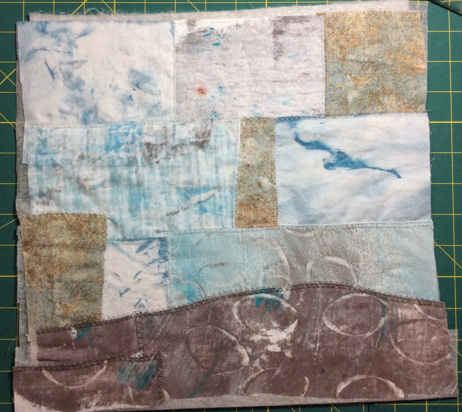
4.) I used matt medium to glue large rectangles of the monoprinted papers and gift wrap onto a cardboard background to create a background. This was a mistake, it turned out, because the cardboard warped when it dried. I should have also applied the matt medium to the back of the cardboard. I applied gesso to the back and then matt medium when I was finished with the whole thing and that did the trick to unwarp it.

5.)  Then, for me, the quick part was over. I couldn't decide where to put the elements. I'm a slow designer. It took several days to decide. But here are the finished collages. I glued all the pieces down with matt medium underneath and then another coat on top of the whole thing.
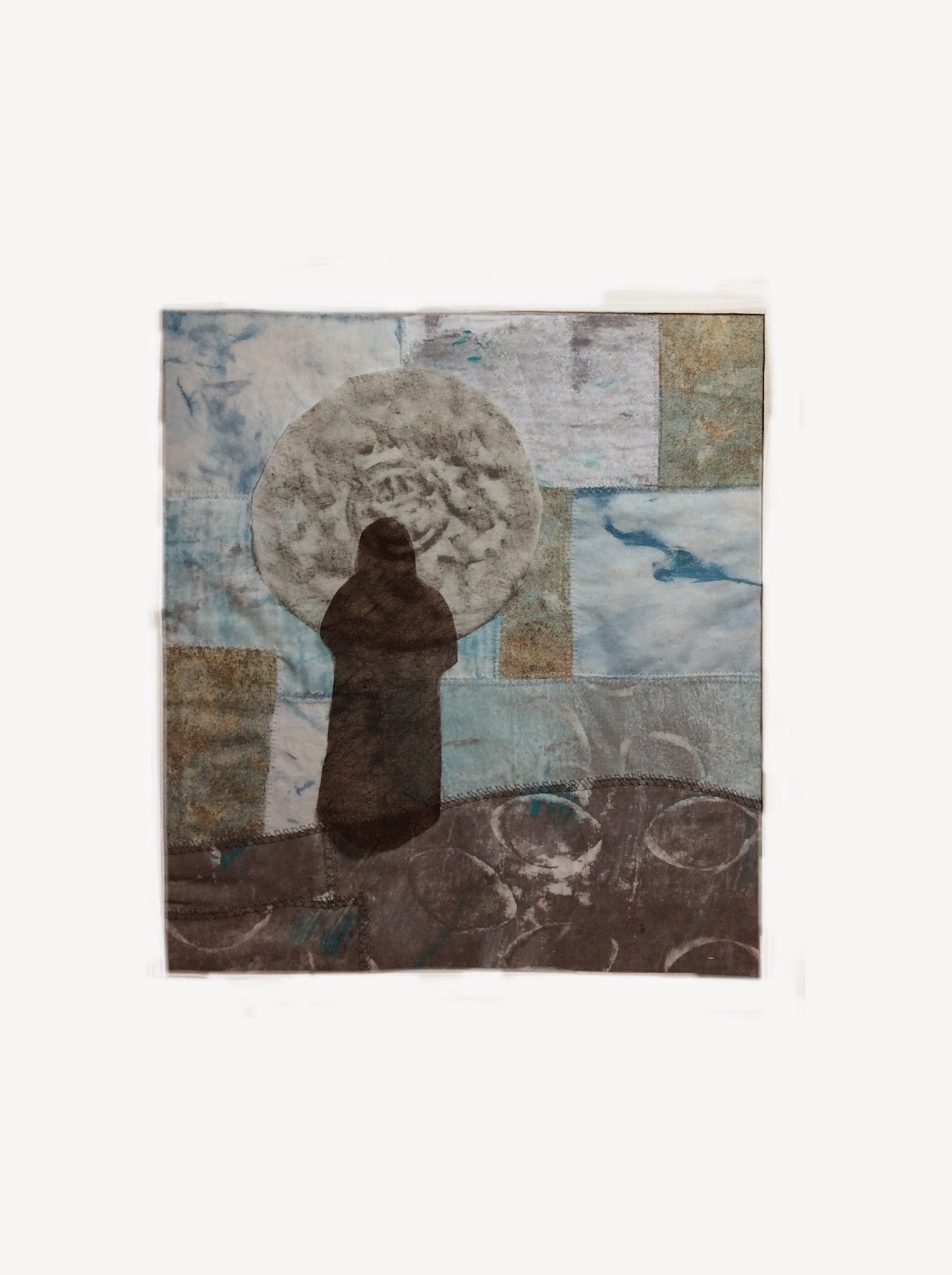
Big Horizons on cardboard
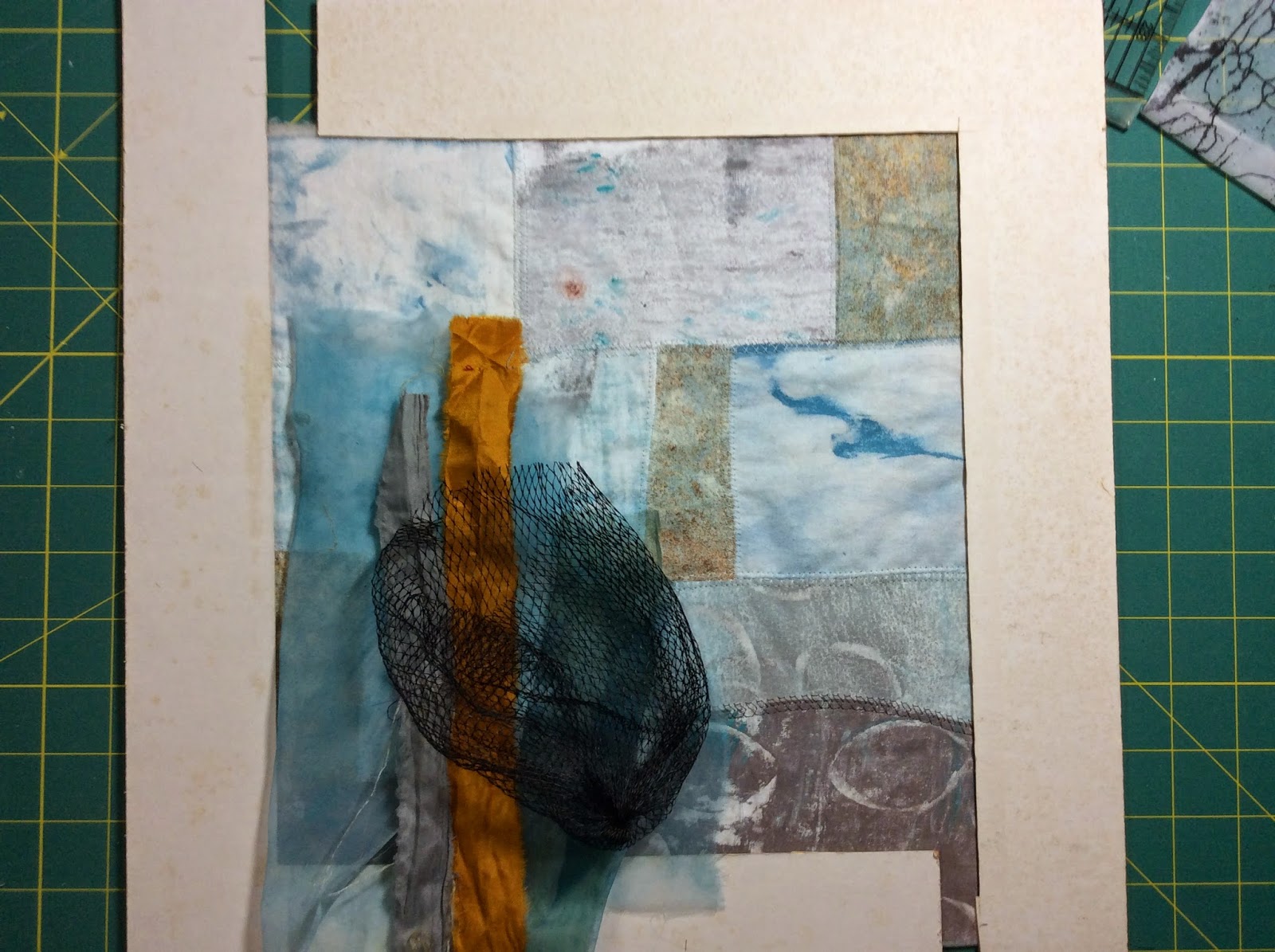
Big Horizons represents my husband and I as travelers, because we do travel a lot. The movie ticket is from The Adventures of TinTin which we saw in 2011. We discovered TinTin together in a used book store in Nepal in 1984 so it is very special to us. We had never heard of it before that. My husband is from Argentina, hence that part of the map.
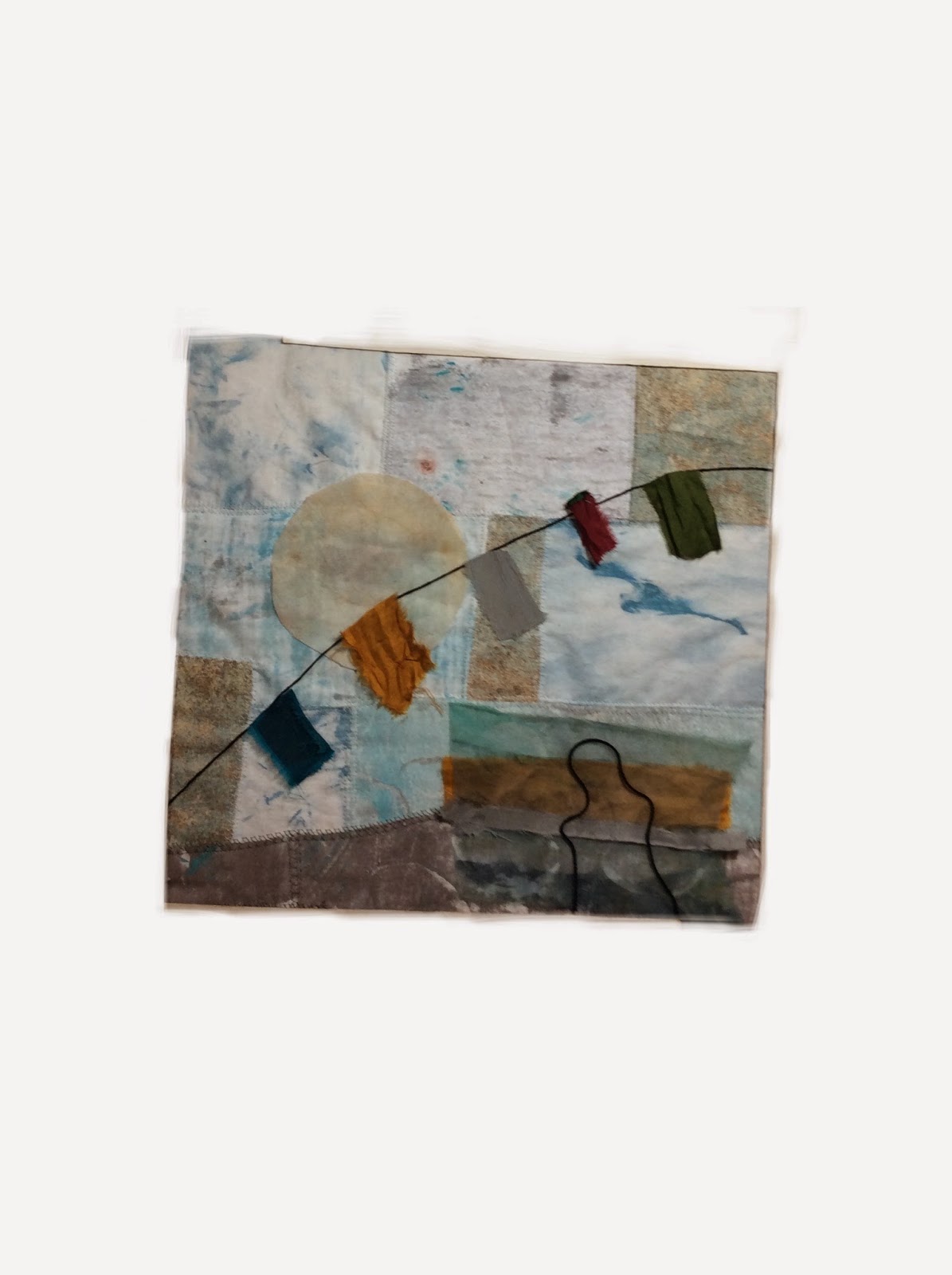
Outside the Lines on cardboard
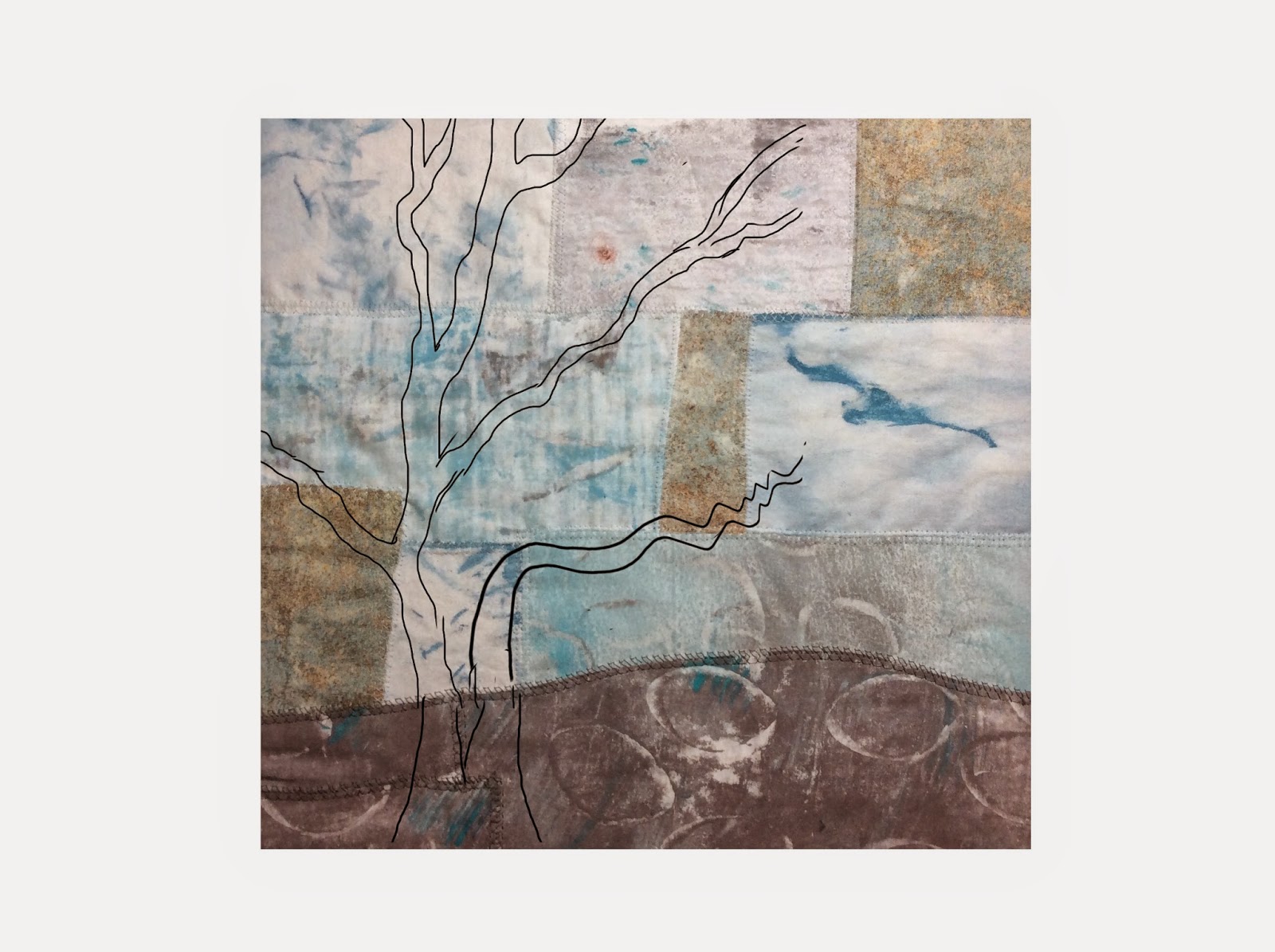
Outside the Lines came about because of the background of the sky. I drew in the dark lines with a gel pen after it was finished.
 
     So the question was still there. What to do with them? They are paper on cardboard. My latest meeting with my art group, ArtsEtc., was about image transfer so that idea was in my head. I decided to scan these images into my computer and print them onto cotton muslin. I knew from experience, that I needed to play with the images in Photoshop Elements before I printed them. What needed to be done, was to enhance the saturation quite a bit because the colors always print a lot more faded than they look. Also, I needed to increase the contrast on the words on the ticket a lot more so that they would show up on the fabric.
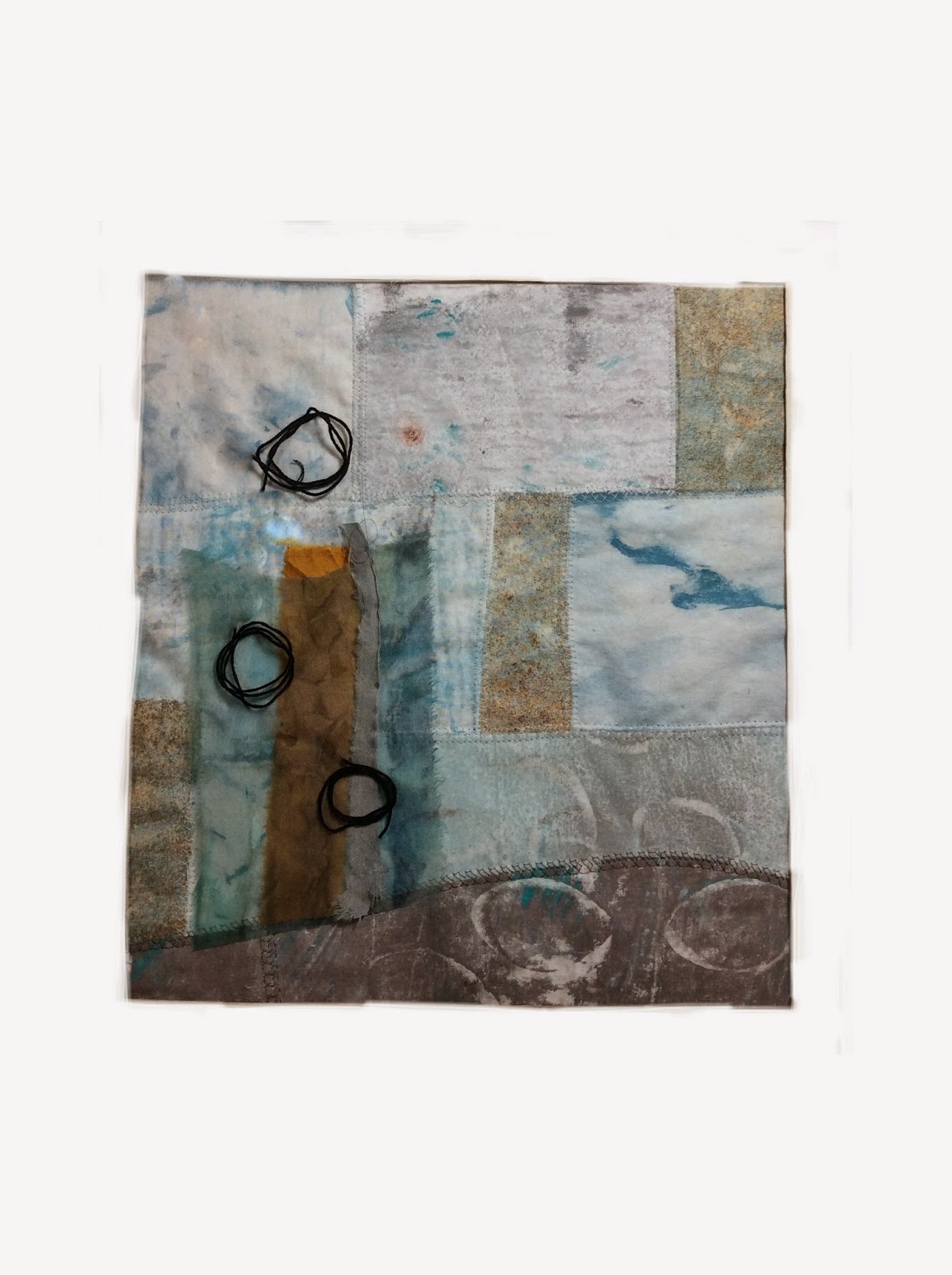
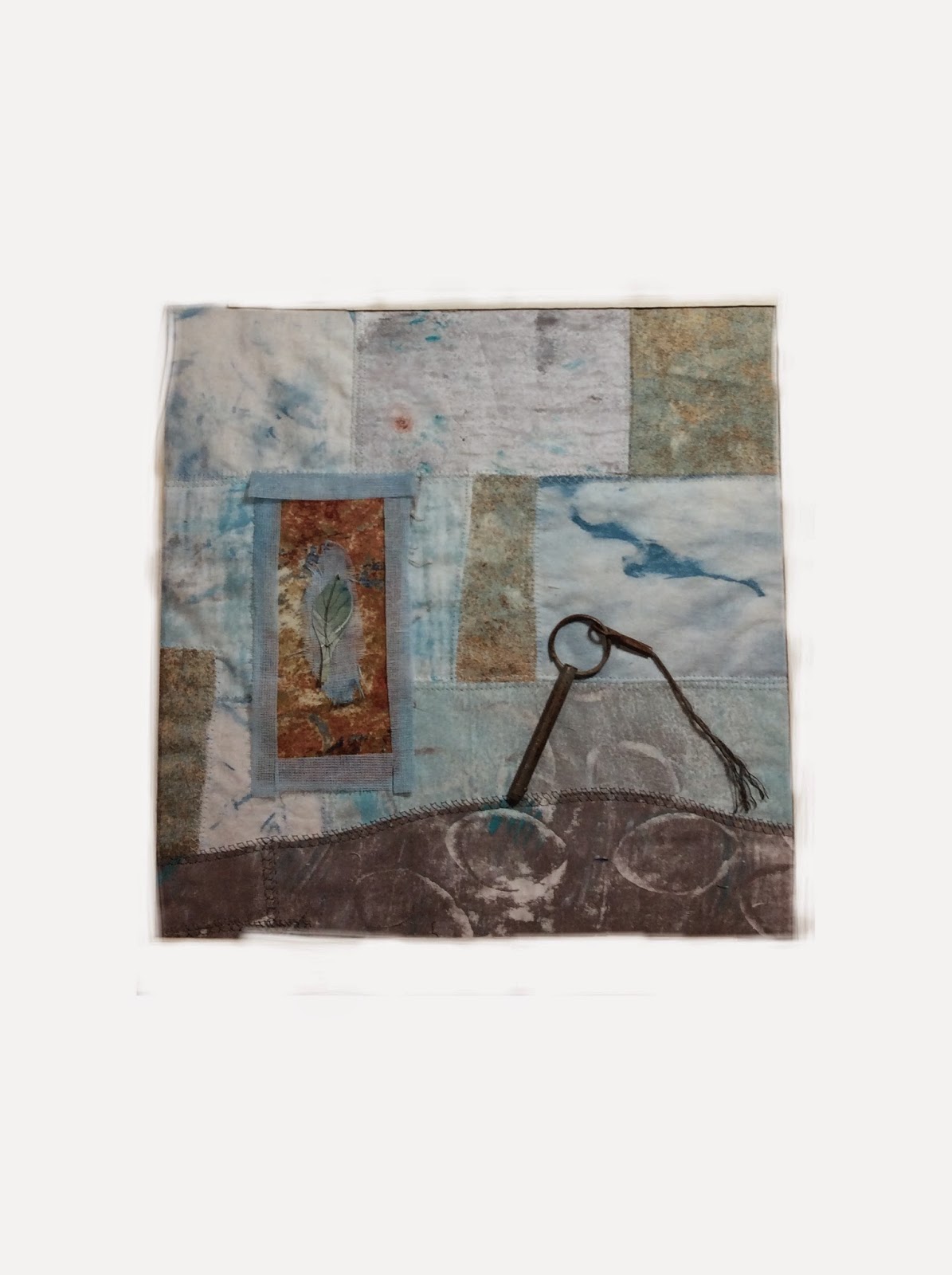
     I printed them, made quilt sandwiches, did some free-motion quilting with black thread, made a pillow-case binding, machine-embroidered around the edge. I ended up having to write on the ticket with pencil to make it darker and then paint on matt medium to make it permanent. Here they are.
Big Horizons finished

Outside the Lines finished
I'll sew on a pop top thing from a can to each back to hang them and hang them in my studio.
I'm linking this to Off The Wall Friday where you can find other art quilt blogs. Please make comments on their posts to let them know you stopped by. Thanks for visiting.