In my last post, I wrote that I had finished a quilt and then realized that suddenly I didn't like it. The problem that I saw, was that my focal point stuck out too much for my liking. I tried some quick fixes, but I didn't like them, either. So I took the quilt to two of my art friends and here is what we did.
First of all, I can't show you the quilt because photos of it have been submitted to a show and I don't like to reveal quilts until the opening of the show (if they have been accepted) or until after they haven't been accepted.
When I designed this quilt, I put the focal point in one of the "sweet spots" as I've learned from workshops and from reading texts. I followed the Rule of Thirds. You divide up your surface as in the diagram below and then put your major elements at the intersections of the lines. Those intersections are the sweet spots.
 |
| Rule of Thirds |
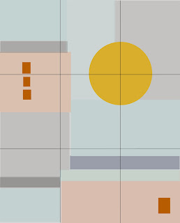
Now, remember, I don't have any formal art training. So I'm trying to learn as much as I can from workshops and books. This particular rule has really helped me in the past. It has kept me from putting my focal points in the dead center of my pieces as I used to think was the thing to do. So here is a general diagram of my design of my quilt. Forgive the colors and blocks. I drew them in Photoshop Elements and got tired of trying to get the exact colors. Also remember I used fabrics with lots of textures and shadings so the quilt has a lot more nuances. Also, the quilt has some design elements of thread sketching that I didn't attempt to include here. You can visit my last post to see the detail photo of the actual quilt.
 |
| Quilt with basic elements |
So I looked at it the morning after I finished it and this huge sun was staring at me. (The sun on the actual quilt has stitching on it so it isn't as boring as this.) No, no, no. How could I not have seen that it was too low on the quilt. And that it was too big. But when I was making it, I auditioned smaller suns and they were too small. It had too much stitching to rip off and redo. Your eye went straight for it and ignored all the other elements on the quilt! Auggh!
Originally, I had it placed higher on the quilt, but I decided to follow the Rule of Thirds and put it in its proper place.
 |
| Following the rules |
At home, before I took it to my friends, I knew I had to distract the eye from the sun, so I cut out some cloud shapes from the same monoprinted, gray fabric used elsewhere in the quilt and pinned them above the sun.
 |
| Distraction |
Yes, they did the job, but way too trite. Not at all what I wanted for this quilt. I tried some sheer fabrics across the sun, but the stitching was so nice on the sun, I didn't want to cover it up. One of my friends, Bobbi Baugh, had a brilliant idea. She picked up the quilt and folded over the top! "But what about the Rule of Thirds?", I asked. Well, we looked at it without those few inches at the top. I liked it better without those few inches so I cut them off and restitched the top closed. To further distract from the sun we three played around with some more squares of fabric and this is how the composition ended.
 |
| the final adjustment |
So The Rule of Thirds, like all rules is a rule meant to be broken. Go with your gut. Feel free to visit Bobbi's website to see her beautiful art
Bobbi Baugh Art . She had an article in Quilting Arts Magazine December 2013/January 2014


Yes, it's much better, the main difference to me is the extra squares in the bottom left, they really pull the eye around the work. Thanks for sharing.
ReplyDeleteLinda
I wish I could share the actual quilt. Not yet. When I can, I'll show photos before and after the adjustment. I'm no means an expert, but part of the reason for my blog is to share my learning process to help others out. I've learned so much from other artists' blogs. I want to pass it on.
ReplyDeleteThat's a really good learning point - thanks for sharing!
ReplyDeleteGlad you visited, Margaret, and enjoyed the post. Thanks.
DeleteI am not sure you have actually broken the rule of thirds - your sun is now in the top third rather than in a sweet spot. This is another way of applying the rule of thirds. And adding the repetition of the orange squares works really well, making the eye travel around the design.
ReplyDeleteNice design - thanks for sharing.
Yes, I guess I basically stuck with the rule. Just modified it a bit. The orange squares in the actual quilt have a lot of pattern on the fabric and are quite interesting in themselves. They are the only commercial fabric on the front of the quilt. From Marcia Derse. I love her fabric.
DeleteRegina it does look better in the top third. Another rule you used with the squares is the rule of repeating images. Looks good.
ReplyDeleteYes, Marilyn, as it turned out, the orange-red blocks ended up in three separate groups, which was much more pleasing than two groups. Odd numbers usually look better. (Don't ask me why, though.)
DeleteWonderful process and great decisions. Well done! It's lovely.
ReplyDeleteI love learning new things and I've already applied this to my next quilt.
ReplyDelete